Color Suite to Bloatware Davinci Resolve 21

The Bloatware Dilemma: Why Resolve 21’s Photo Page Has Colorists Ringing the Alarm

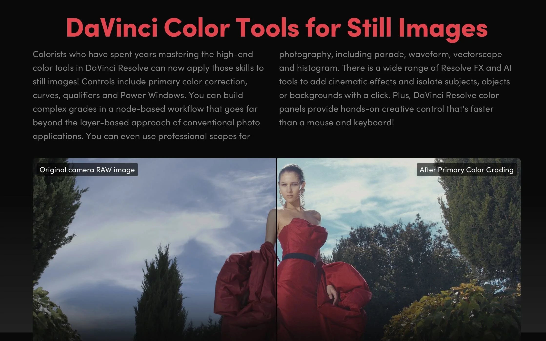
Blackmagic Design dropped DaVinci Resolve 21, and the headline feature sparked an immediate civil war in the post-production community. Alongside expected AI upgrades like IntelliTrack, Blackmagic unveiled a fully dedicated Photo Page designed to process, manage, and grade RAW still photography using Resolve’s famous node-based system.

While hybrid content creators praised the update as a potential "Adobe killer," professional colorists are pushing back hard. The community consensus? Blackmagic is steering its flagship program directly into "jack of all trades, master of none" territory, risking the very stability that made the software an industry standard.

The All-in-One Trap: From Color Suite to Bloatware

For a decade, Blackmagic’s aggressive expansion has been celebrated. They took an elite, expensive color-grading platform and seamlessly stitched in the Edit, Cut, Fusion (VFX), and Fairlight (Audio) pages. It was a masterclass in disruption.

However, with the introduction of the Photo page, colorists argue that Blackmagic has crossed a line from "post-production suite" to unnecessary software bloat. Video and film are time-based mediums. Photography is spatial and static. Forcing a photo cataloging and raw processing system into a video render engine feels less like a strategic evolution and more like a feature-creep identity crisis.

Why Colorists Are Criticizing the Photo Page

The core objection from colorists isn't that they hate photographers; it's that they fear code instability and distracted development priorities.

  • The "Jack of All Trades" Dilution: When software tries to handle everything—from 3D spatial audio mastering to Lightroom catalog migrations—engineering resources get split. Colorists are frustrated that decades-old bugs or niche workflow requests on the Color Page are taking a backseat to building tethering systems for still cameras.

  • The Lightroom Comparison is Flawed: YouTube thumbnails might scream "Goodbye Lightroom," but professionals know better. Resolve 21 lacks critical photographer infrastructure: standard print modules, advanced lens correction profiles, pixel-level healing brushes, and native DNG exports. It’s clunky for photographers, making it a feature nobody asked for.

  • Performance Hijacking: Running a high-end color panel (like the Advanced Panel) to tweak a single JPEG image feels absurd. Colorists worry that the underlying database and GPU acceleration architectures will suffer under the weight of managing thousands of high-megapixel static image files alongside heavy timelines.

A Warning from Creative History

The industry has seen this movie before, and it didn't end well. Look no further than Adobe. Photoshop, once a pure digital darkroom, became bloated with 3D engines and video timelines that users despised, forcing Adobe to eventually strip them out.

By pushing Resolve into the photo arena, Blackmagic risks alienating the core demographic that built the software's prestige: the professional colorist. When Hollywood facilities choose a color grading platform, they choose it because it is the absolute master of color—not because it can also edit a wedding photographer's RAW files.

Final Thoughts: Stick to the Code

Blackmagic Design deserves credit for their legendary free-update model and fierce defense of perpetual licenses. But DaVinci Resolve 21's Photo page feels like a feature built for marketing bullet points rather than professional necessity.

If Blackmagic wants to conquer the photography market, they should build a dedicated standalone app. Forcing it into Resolve risks breaking the finest color tool ever made by turning it into a sluggish, generalized ecosystem. Sometimes, being the master of one is exactly what the industry needs.

What are your thoughts on Resolve 21? Are you using the Photo page, or do you think Blackmagic needs to stop adding pages and focus on core stability? Let’s discuss in the comments below.

How to create a film look? Arri Film Lab

ARRI Film Lab Review: A Colorist’s Take on Bringing Film Character to Digital

As a colorist, I’m always slightly suspicious of anything promising to make digital footage look like film.

Film emulation has become a crowded category, and there are plenty of plugins that can add grain, halation, contrast, or a vintage color palette. The difficult part isn’t adding those characteristics individually—it’s making them feel like they belong to the image.

That is what makes ARRI Film Lab interesting.

Developed by ARRI and released as a license-based OpenFX plugin, Film Lab is designed to bring the characteristics of analog film into a digital workflow. It gives the colorist control over film grain, color characteristics, halation, and gate weave, while working inside applications such as DaVinci Resolve and Baselight. It supports ARRI LogC3 and LogC4 workflows and can also be used with footage from other cameras when brought into the appropriate ARRI color pipeline.

First Impression: Simplicity Is the Strength

The first thing I noticed about Film Lab is how deliberately simple it is.

Instead of giving the colorist dozens of parameters for building a film response from scratch, ARRI concentrates the controls around a few recognizable characteristics. Grain can be based around 50D, 200T, or 500T negative-film characteristics, while the color section provides different print-stock and processing options, including reversal and bleach bypass. There are also controls for halation and gate weave.

From a grading perspective, I actually appreciate this approach.

A film-emulation tool can easily become another rabbit hole inside the grading suite. You start adjusting grain size, softness, chroma response, highlight roll-off and several other parameters, and suddenly you're spending more time building the emulation than grading the picture.

Film Lab feels more like a finishing tool than a laboratory experiment.

You make your primary correction, establish the creative look, and then use Film Lab to introduce the film character.

The Grain

Grain is probably the first thing most people will look at when evaluating Film Lab.

ARRI gives you three negative-film references—50D, 200T and 500T. The important thing, of course, is that these aren't literally turning your digital camera into a particular physical film stock. They are digital recreations of characteristics associated with those stocks.

I found the restraint particularly useful.

Good film grain shouldn't announce itself immediately. It should become part of the texture of the image. At stronger settings, the effect becomes obviously stylized, but at lower intensities it can help take some of the sterile perfection out of digital footage.

That distinction matters.

The goal isn't necessarily to make the audience think, “That's film grain.” The goal is to make them feel that the image has a different physical quality.

Color: Where Film Lab Becomes More Interesting

For me, the more important part of Film Lab isn't actually the grain. It's the way the color response interacts with the image.

ARRI describes the color controls as covering different print-stock characteristics, reversal-film characteristics and bleach-bypass processes.

This gives the colorist a useful starting point for developing a film-inspired palette without forcing the entire grade into an aggressive “film look.”

That's important because film character isn't simply warm highlights plus grain.

The relationship between skin tones, neutrals, saturated colors and shadows is what ultimately determines whether an image feels convincing.

With Film Lab, I prefer approaching the tool as the final layer of a grade rather than using it as the grade itself.

First establish exposure.

Then balance the image.

Then build the creative color palette.

Then let Film Lab provide the texture and film response.

That workflow keeps the colorist in control.

Halation: Less Is More

Halation is another feature that can easily be overused.

Film Lab simulates the red/orange glow that can occur around bright areas as light interacts with the different layers of photographic film.

Used carefully, this can be beautiful.

Used aggressively, it immediately looks like an effect.

My preference would be to keep halation relatively subtle, particularly on narrative work. The effect becomes most convincing when you notice the overall image feels more organic rather than when you can immediately identify a red halo around every practical light.

This is one area where the colorist's judgment matters more than the plugin's capabilities.

It Works Especially Well With ARRI Footage

This is where Film Lab makes the most sense to me.

ARRI has built the tool around its broader imaging ecosystem, and it supports LogC3/AWG3 and LogC4/AWG4 workflows. It can process RGB images from ARRI cameras as well as third-party cameras when they're correctly brought into the ARRI pipeline.

There is a reason this matters.

ARRI's camera images already give the colorist a strong foundation. Film Lab isn't trying to rescue poor footage. Instead, it can complement an image that is already technically solid and creatively well exposed.

That is perhaps the biggest lesson with tools like this:

Film emulation can't replace good cinematography.

Lighting, exposure, lenses, production design and filtration still determine the fundamental character of the image. Film Lab works best when those decisions are already doing the heavy lifting.

The ARRI Look Library

Another useful part of the ecosystem is the integration with ARRI's Look Library.

The Film Lab workflow can be combined with ARRI's predefined looks, giving the colorist a starting point for different visual directions. Independent testing has highlighted the usefulness of combining the Look Library with Film Lab while reducing the intensity of individual looks rather than simply running everything at full strength.

And that's probably how I would recommend using it.

Don't treat a preset as a finished grade.

Treat it as a creative starting point.

A good colorist should still be able to decide what the image needs rather than letting a preset make every creative decision.

The Workflow in Resolve

For a DaVinci Resolve colorist, the workflow is refreshingly straightforward.

Film Lab is available as an OpenFX plugin and can operate in real time at 4K with supported RGB workflows.

I would generally keep it toward the end of the creative node structure, after the image has been balanced and the main look has been established.

That makes it easier to control how much of the film character you're actually introducing.

It also means you can bypass or adjust the Film Lab treatment without rebuilding your entire grade.

That flexibility is particularly valuable when you're working on a long-form project where consistency between hundreds or thousands of shots becomes more important than making one spectacular still frame.

Where I Think Film Lab Falls Short

Film Lab's simplicity is also its limitation.

If you're the kind of colorist who wants extremely granular control over every aspect of a film-emulation process, Film Lab may feel restrictive compared with more elaborate dedicated film-emulation systems.

There are fewer knobs.

But I'm not convinced that's necessarily a problem.

More controls don't automatically produce a better image.

In fact, one of the strengths of Film Lab is that ARRI has made it difficult to endlessly over-engineer the look. Independent testing has similarly praised the plugin's straightforward approach and its ability to produce attractive results without extensive adjustment.

The other consideration is workflow. Although Film Lab can work with non-ARRI footage, it is clearly most naturally integrated into an ARRI color-managed environment. RE Effects notes that projects need to be working through the ARRI color-management pipeline, with ACES support planned.

So if your facility is built around a completely different color-management philosophy, you should test Film Lab carefully before making it part of a standardized pipeline.

My Verdict as a Colorist

ARRI Film Lab isn't trying to replace the colorist.

And that's exactly why I like it.

The best film-emulation tools don't make the grade for you. They give you another layer of photographic character that you can shape according to the needs of the project.

For me, Film Lab works particularly well when the brief is:

“Make this digital image feel photographic, organic and cinematic—but don't make it look like a plugin.”

Its biggest strength is its restraint.

The grain is easy to control. The color treatments provide a useful film-inspired foundation. Halation can add another layer of realism, and the overall workflow fits naturally into ARRI's ecosystem.

It won't magically turn every digital image into 35mm film. Nothing can.

But when used with good photography and a thoughtful grade, ARRI Film Lab can take an already strong digital image and give it that final bit of texture and imperfection that makes it feel less like a collection of pixels and more like a photographed image.

For ARRI-based workflows, I'd definitely put it on the shortlist of film-emulation tools worth testing.

Not because it gives the colorist more controls—but because it gives the colorist the right controls.

ARRI Film Lab — official ARRI page

ARRI Film Lab — RE Effects

True Hollywood Film Look - Filmbox Pro

Filmbox Pro: The Ultimate Film Look Development Tool for a True Hollywood Film Look in 2026

As a professional video colorist, I am always looking for tools that do more than simply add a “film LUT” to an image. A convincing cinematic image is not just about contrast, saturation, or adding grain. It is about how color, density, highlight roll-off, texture, halation, acutance, and print characteristics interact as a complete imaging system.

That is why Filmbox Pro has become one of my favorite tools for film look development.

Rather than treating film as a preset or a simple LUT, Filmbox Pro approaches the problem as a photochemical imaging process. Video Village describes it as a comprehensive emulation of the characteristics of film negative and print, including color response, tone, grain, halation and other spatial characteristics.

For colorists working on commercials, music videos, features, episodics and high-end branded content, this makes Filmbox Pro a particularly powerful starting point for developing a sophisticated Hollywood-style film aesthetic.

Why Film Look Development Is More Than a LUT

One of the biggest mistakes in digital color grading is thinking that a cinematic look can be created simply by applying a LUT.

A LUT primarily describes a mathematical color transformation. Film, however, is a physical imaging process.

Film responds differently to exposure, color, density and contrast. Highlights do not simply become brighter; they develop characteristic density and color behavior. Bright sources can interact with the emulsion to create halation. Grain is related to the photographic process rather than being a uniform overlay.

That distinction matters.

When I develop a film look, I want the image to feel as though it has passed through a coherent imaging pipeline—not as though someone placed a grain layer and a vintage LUT on top of digital footage.

This is where Filmbox Pro becomes particularly interesting.

Filmbox Pro Treats Film as a Complete Imaging System

One of the strongest aspects of Filmbox Pro is its architecture.

Instead of providing only a final color transform, Filmbox Pro separates the process into components such as Camera, Negative, Lab, Print and Display. This allows the colorist to approach the image more like a traditional film workflow.

The Negative stage can influence characteristics such as:

  • Color and tone

  • Grain

  • Halation

  • Acutance

  • Gate weave

  • Flicker

  • Aura

The Lab stage provides another level of creative control, while the Print stage allows the final character of the image to be shaped as though the negative were being printed.

This is a fundamentally different approach from simply choosing a “cinematic LUT.”

The Negative-to-Print Workflow Is a Major Advantage

For serious look development, one of my favorite features is Filmbox Pro's ability to separate Negative Only and Print Only processing.

You can create a workflow where Filmbox first creates the characteristics of a film negative, perform creative grading between the negative and print stages, and then apply the print process afterward.

This effectively gives the colorist a digital approximation of a film-DI workflow. Video Village specifically recommends this multi-node approach when you want creative operations to behave as though they are being performed between negative and print.

For me, this is where Filmbox Pro moves beyond being a “film look plugin” and becomes a look-development environment.

The Difference Is in the Highlight and Skin-Tone Behavior

A great film look should not make every image orange and teal.

In professional work, particularly narrative cinema and premium advertising, I want skin tones to remain believable while the surrounding palette develops character.

Filmbox Pro's film-based color response can provide a much more sophisticated starting point for this than simply manipulating saturation and contrast.

The goal isn't to make the audience think:

“That has a film LUT on it.”

The goal is for the audience to simply feel that the image has cinematic density, texture and dimensionality.

That subtlety is what I look for.

Halation That Actually Feels Photochemical

Halation is another area where many digital film-emulation workflows fall short.

A simple blur or colored glow around highlights can quickly look artificial.

Filmbox Pro approaches halation as part of its spatial film simulation, with controls for radius, opacity, color and larger-scale aura characteristics.

Used carefully, this can help create the subtle separation around practical lights, windows, specular highlights and high-contrast edges that audiences subconsciously associate with film.

The key word is subtle.

As a colorist, I would rarely recommend turning halation up simply because the control is available. The best film effects are often the ones viewers don't consciously notice.

Grain Should Be Part of the Image, Not an Overlay

Digital grain overlays often look like texture placed over a digital image.

Film grain should feel integrated with the image formation process.

Filmbox Pro's grain processing is designed around the emulated negative, rather than simply applying a generic noise layer. The plugin also provides detailed control over the negative's spatial characteristics.

This makes a significant difference when you're trying to create a premium 35mm or large-format aesthetic.

And importantly, more grain doesn't automatically mean more cinematic.

For a Hollywood commercial, I may want extremely restrained texture. For a period drama or independent feature, I may push the texture considerably further.

The creative decision should follow the story, not the plugin.

Choosing the Right Film Stock

Another reason I recommend Filmbox Pro for serious look development is the range of film systems and stocks available.

The current Filmbox Pro ecosystem includes systems such as Vision3 and Vintage Cinema, with different negative and print characteristics designed to work together.

This gives the colorist a much more useful question than:

“Which LUT looks cinematic?”

Instead, the question becomes:

“What photographic behavior supports this story?”

Do I want:

  • Clean, modern 35mm?

  • Softer vintage color?

  • Fine-grain large-format character?

  • Stronger halation?

  • More restrained saturation?

  • A warmer print response?

  • A more nostalgic negative?

  • A harder, more graphic contrast structure?

These decisions become part of the look-development process.

Start With Filmbox—Then Grade

One important point: I don't believe Filmbox Pro should replace the colorist.

It should empower the colorist.

I generally think of Filmbox as a sophisticated film-imaging stage inside the grading pipeline rather than a magic button.

For example, exposure, balance and major image corrections can be performed before Filmbox, allowing the film emulation to respond to the image appropriately. Video Village recommends scene-referred, photometrically accurate operations upstream when authenticity is the goal.

From there, the colorist can use the Negative/Lab/Print architecture to develop the creative look.

That gives you considerably more control than applying a finished LUT at the end of the node tree.

Filmbox Pro Fits Modern Color-Managed Workflows

Another reason I consider Filmbox Pro particularly relevant to modern professional post-production is its support for advanced color pipelines.

It supports ACES 1.3, ACES 2.0 and Resolve Color Management, along with SDR and HDR workflows. It also supports major camera and intermediate color spaces.

This matters because today's productions increasingly move between:

  • ARRI LogC

  • RED

  • Sony

  • Canon

  • Blackmagic RAW

  • ACES

  • DaVinci Wide Gamut

  • HDR

  • Rec.709

  • P3

  • Streaming deliverables

A film look shouldn't fall apart simply because the project has a sophisticated color pipeline.

My Recommended Approach for a Hollywood-Style Look

If I'm developing a film look from digital camera footage, my philosophy is simple:

Don't try to make digital footage look “old.” Make it behave more like film.

I would start with properly managed, scene-referred camera footage.

Then:

1. Establish exposure and white balance

Get the image technically and photographically balanced before trying to create the look.

2. Choose the film system

Select the negative/print combination that fits the project rather than selecting a preset simply because it looks impressive on one shot.

3. Establish the negative character

Shape color response, density, contrast, grain and halation.

4. Develop the creative look

Use the Lab and, when appropriate, grade between Negative and Print.

5. Control the print

The Print stage can become the final creative personality of the image.

6. Finish for the delivery space

Make sure the final image is correctly transformed for the intended SDR, HDR or cinema mastering environment.

This approach produces a look that feels intentional rather than filtered.

Why I Recommend Filmbox Pro

There are many excellent tools available to colorists today.

But Filmbox Pro stands out because it doesn't simply ask:

“What film LUT do you want?”

It asks a much more interesting question:

“How do you want this image to behave as film?”

That difference is enormous.

Its combination of film-negative modeling, print processing, grain, halation, acutance, film systems, advanced lab controls and color-managed workflow support gives professional colorists a remarkably deep environment for developing film-inspired images.

And the included Looks Library can also provide useful starting points before moving into the deeper Pro controls. The library contains more than 100 presets designed as starting points for different aesthetics and film characteristics.

Final Thoughts

For me, the best film emulation is not the one that screams “FILM.”

It is the one that gives the image:

better color separation, richer tonal relationships, natural highlight behavior, organic texture, dimensionality and photographic character.

That's why Filmbox Pro is one of the first tools I would consider when developing a premium cinematic film look from digital footage.

Whether I'm working on a feature film, episodic series, commercial, music video or branded project, the objective remains the same:

Don't put a film look on the image. Build the image as if it were photographed on film.

That is where Filmbox Pro becomes extremely powerful.

Explore Filmbox Pro by Video Village

Disclosure: Filmbox Pro is a commercial product from Video Village. This article reflects my professional assessment of its capabilities as a film-look-development tool.

Download free DCTLs: The Ultimate Secret Weapon for DaVinci Colorists

DCTL (DaVinci Color Transform Language) is a C-like programming language built directly into DaVinci Resolve Studio that executes custom color math on your GPU. Unlike traditional LookUp Tables (LUTs) that force colors into rigid, pre-calculated grids, DCTLs compute exact mathematical formulas pixel-by-pixel using 32-bit floating-point math. This means your footage maintains total dynamic range without hard-clipping or artifacting.

If you want to move beyond standard presets and build or use elite, mathematically perfect color tools, understanding DCTLs is your next evolutionary step.

📊 DCTL vs. LUT: The Core Differences

Many editors confuse DCTLs with LUTs because they can sit in the same folder. However, the underlying technology makes DCTLs vastly superior for high-end workflows.

LUT
Uses static, pre-baked interpolation grids.
Risk of banding or artifacting.
Global opacity slider only.
Clips data outside 0–100% ranges.

DCTL (Color Transform Language)
Runs live mathematical formulas on the GPU.
32-bit floating-point precision.
Custom UI sliders and drop-down menus.
Preserves out-of-bounds image data.

🛠️ The Best DCTL Tools Every Colorist Needs

The color science community develops specialized DCTLs to perform tasks that native Resolve tools cannot replicate easily. Here are some of the most powerful options available:

  • Film Density Emulators: Tools like the Nx Density DCTL add deep, filmic saturation to specific hues without muddying dark areas.

  • Aura (FlexiMist): A specialized script that recreates iconic glass diffusion filters like ProMist directly inside your post-production suite.

  • Iridescent Color Saturator: An adaptive saturation tool that boosts low and mid-saturations without creating chroma noise.

  • NOIR Generator: A highly flexible, free pattern utility used for signal testing and analyzing spatial effects in your node tree.

  • PixelTools Exposure & Checker: High-end utilities designed to accurately map middle grey and monitor exposure.

Are you looking to buy professional DCTLs for your workflow, or are you trying to write a specific color-grading plugin yourself? Let me know, and I can give you a curated list of vendors or provide a custom code snippet!

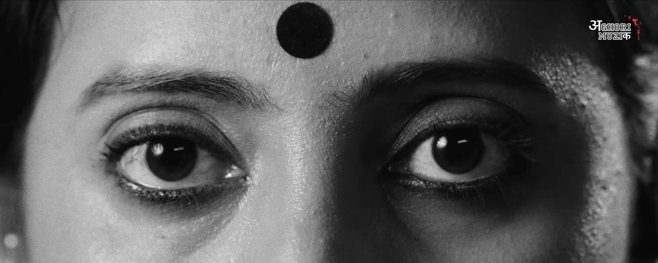
Color Grading for “Garba Gheli” | Aghori Muzik ft. Salim Merchant Filmikwork, Hollywood

Color Grading for “Garba Gheli” | Aghori Muzik ft. Salim Merchant

Color Artist: Sudip Shrestha | Filmikwork

“Garba Gheli,” the latest Hindi music video from Aghori Muzik, featuring legendary singer Salim Merchant.

Filmikwork provided professional music video color grading and color finishing for this vibrant celebration of Garba, Gujarat, and Navratri. The grade focused on rich colors, natural skin tones, cinematic contrast, and a polished contemporary music-video look.

The project brought together a talented creative team from India, with the final color finishing completed by Filmikwork.

Project: Garba Gheli – Aghori Muzik ft. Salim Merchant
Colorist: Sudip Shrestha
Color House: Filmikwork , Hollywood
Director: BIBTYA
DOP: Hardik Soni, Akshay Roshiya, Ronak Soni

Looking for a professional colorist in Los Angeles or Hollywood for your next music video, commercial, film, or digital project? Filmic LA provides professional color grading, color correction, and finishing services for clients in Los Angeles, Hollywood, India, and worldwide.

Hoyte van Hoytema - Master of Modern Cinematography

Hoyte van Hoytema - The Dutch Master of Modern Cinematography

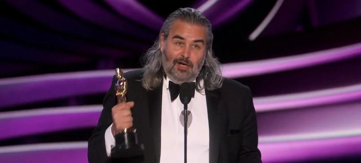
If you have marveled at the vast, terrifying emptiness of space in Interstellar or felt the claustrophobic tension of a World War II beach in Dunkirk, you have seen the world through the eyes of Hoyte van Hoytema. Born in Switzerland to Dutch parents and rejected twice by Dutch film schools, van Hoytema forged his own path at the National Film School in Łódź, Poland, eventually becoming one of the most influential cinematographers working today.

hoytema

Hoyte van Hoytema

Filmik - Master of Cinematography


The "Hoytema" Signature Style

What makes his work instantly recognizable? It is the contradiction of intimacy on a massive scale.

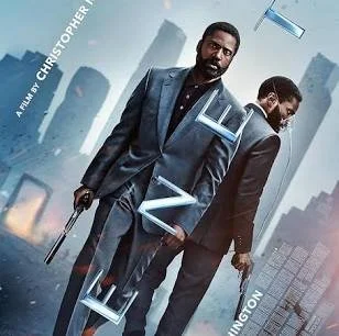
  • Humanizing IMAX: Van Hoytema is famous for shouldering massive IMAX cameras as if they were lightweight documentary rigs. On films like Tenet and Nope, he used handheld techniques to keep the audience physically close to the characters, making blockbuster spectacles feel personal and grounded.

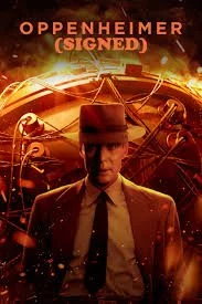
  • The Texture of Film: A staunch advocate for celluloid, he prefers the organic grain of film over digital. For Oppenheimer, he even pushed Kodak to create a brand-new 65mm black-and-white film stock to distinguish the timeline, a historic first for cinema.
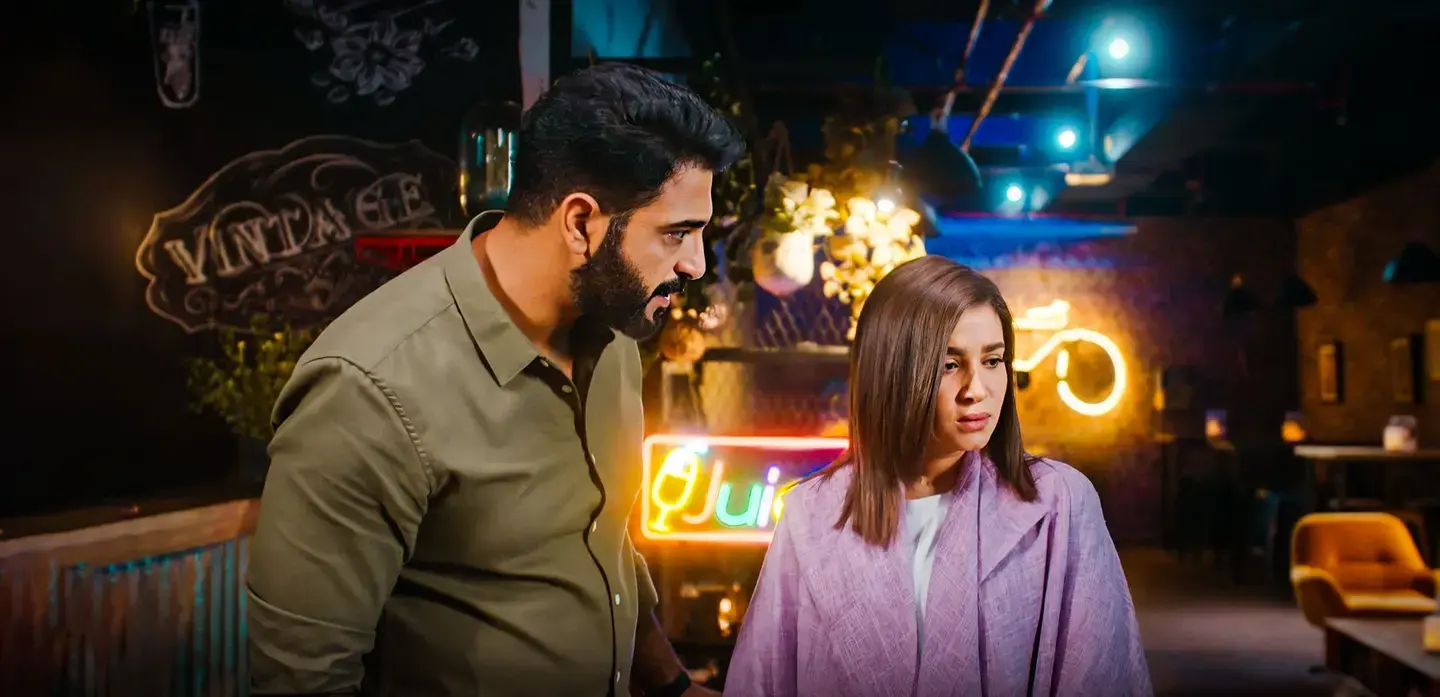
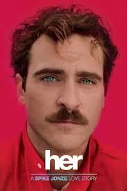
  • Natural Lighting & Shallow Focus: He often relies on natural light and "dirty" practical sources rather than over-polished studio lighting. In Her, he used a shallow depth of field (blurry background) to isolate the protagonist, emphasizing his loneliness in a crowded future.

    Why He Matters

    Hoyte van Hoytema proves that cinematography is not just about "pretty shots"—it is about emotion. Whether capturing a vampire in the snow or an atomic bomb test in the desert, his camera always prioritizes the human feeling within the frame.


    Trivia: "Did you know he was rejected by film school twice before winning an Oscar?".

LA 411 Directory is a Must-Have for Colorists

Beyond the Scope: Why the LA 411 Directory is a Must-Have for Colorists

In the world of color grading, technical skill in DaVinci Resolve or Baselight is a given, but professional success often hinges on something more foundational: connection and visibility. The LA 411 Directory, a long-standing staple in Hollywood, is an invaluable resource for post-production professionals, including colorists and post-production houses.

If you're a colorist looking to expand your network, find new projects, or source the best post-production resources in Southern California, understanding and utilizing the LA 411 is essential.

What is the LA 411 Directory?

The LA 411 is the definitive, verified production directory for the film and television industry in Southern California. Unlike a generic online search, every listing within the directory is verified, ensuring a high standard of quality and professionalism. It covers the entire spectrum of production needs, from pre-production to final delivery.

For a colorist, the "Post Production" section is where the gold lies, offering direct access to:

  • Audio post facilities

  • VFX houses

  • Editors and post-production supervisors

  • And, crucially, other post-production houses and studios that may need freelance or staff colorists

How Colorists Can Leverage the LA 411

The directory serves several key functions for a grading professional:

1. Networking and Job Opportunities

Growing your network is vital, as referrals often lead to paid work. The LA 411 provides a structured way to identify and connect with the decision-makers at production companies, advertising agencies, and post-production studios who hire colorists. Listing your own services (or ensuring the facility you work for is listed) increases your visibility to producers and DPs actively seeking color expertise. Job opportunities are also sometimes posted directly through the platform.

2. Sourcing Collaboration Partners

Color grading doesn't happen in a vacuum. A successful post-production workflow requires seamless collaboration with editors, sound designers, and VFX teams. The LA 411 allows you to find reliable, high-end professionals for a specific project. Need to recommend a reputable post-production supervisor or a sound mixing facility? The directory has vetted options readily available.

3. Staying Informed on Industry Trends

LA 411 is more than just a list of names; it's a hub of industry information. Their blog and press releases frequently cover relevant post-production topics, such as the rise of remote grading workflows or new technology. Staying current on these topics can inform your own business practices and keep you competitive.

A Powerful Tool in Your Arsenal

Technical skills get your foot in the door, but industry knowledge and a strong network keep you in the room. The LA 411 website is an essential resource for any colorist serious about building a sustainable and successful career in the demanding Los Angeles film and television market.

Don't just be a great colorist; be a well-connected professional who knows where to find every resource necessary to bring a project to the finish line.

SDR to HDR Dolby vision mastering using AI using transkoder colorfront

Dolby Vision mastering with Transkoder, AI-powered quality control tools, cloud-computing implementations, integration with Apple Vision Pro, and enhancements to Colorfront Engine, empowering content creators with cutting-edge solutions for the evolving media landscape.

Colorfront Transkoder is the ultimate tool for DCP and IMF mastering, including: the industy's highest performance JPEG2000 encoding and decoding, 32-bit floating point processing on multiple GPUs, MXF wrapping, accelerated checksums and AES encryption and decryption, IMF/IMP and DCI/DCP package authoring, editing, transwrapping.

Colorfront Engine has also been updated to optimize color volume remapping and rendering of extreme colors in new digital cameras, further enhancing color-managed workflows in broadcast, live events, and on-set applications.

Moreover, Colorfront introduces advanced AI vision-analysis tools to assist master QC operations, enhancing productivity by detecting framing anomalies, dead pixels, bright titles, and sparkles.

The company’s popular On-Set Dailies and Express Dailies support the latest digital camera formats and feature augmented capabilities for ACES 1.3 workflows, tools for retiming HFR clips, and AI tools for detecting various anomalies.

Pure color Infinite creativity - Filmlight Baselight 6.0

FilmLight has introduced the latest iteration of its grading software, Baselight 6.0. This release, following an extensive beta program, incorporates years of machine learning (ML) development and introduces features aimed at boosting productivity and fostering creativity.

Among the enhancements are a refined and modernized timeline, a new primary grading tool called X Grade, a revamped development tool named Chromogen, and a novel ML-driven tool known as Face Track. Face Track is designed to identify and track faces within a scene, adapting to their movements and rotations. It associates a polygon mesh with each face, facilitating the distortion of perspective-aware tools like Paint and Shapes with the mesh. Colorists can seamlessly apply corrections and enhancements made in Face Track to the entire timeline through a simple copy-and-paste process, ensuring consistency across a sequence or episode.

Martin Tlaskal, head of development at FilmLight, expressed the belief that this release significantly advances their technology, providing a platform that aligns with the needs of contemporary colorists. Face Track, in particular, is highlighted for its ability to substantially reduce the time spent on beauty work by colorists, streamlining processes and corrections across characters. Leveraging machine learning, Face Track revolutionizes face tracking, allowing colorists to make corrections and enhancements across multiple scenes efficiently.

Freelance colorists, including Cem Ozkilicci and Raúl Lavado, who participated in the beta program, praised Face Track as a game changer. It reduces time spent on tedious tasks like keying and shaping, providing efficiency in brightening/darkening faces, lifting eyes, and handling beauty and skin work. With the integration of paint tools, Face Track becomes even more potent, enabling colorists to focus more on grading and less on drawing shapes and tracking.

Leading up to the Baselight 6.0 release, FilmLight developed Flexi, a framework facilitating the swift integration of future ML-based tools into Baselight. The new tools in Baselight 6.0 encompass the RIFE ML-based retimer, a redesigned Curve Grade, integrated alpha for seamless compositing, an improved Gallery for enhanced searching and sorting, and various new and enhanced color tools such as Sharpen Luma, a built-in Lens Flare tool, Bokeh for out-of-focus camera effects, Loupe magnifying for precise adjustments, an upgraded Hue Angle, and more.

Digital Cinema colorist Sudip Shrestha have lauded the creative leap provided by Baselight 6.0, expressing excitement about the impact of new tools such as X Grade and Chromogen, along with the other upgrades, on their ability to deliver and realize their creative vision.

Heartfelt thanks for UAE Golden Visa - Sudip Shrestha

To,
Government of UAE

I am writing this blog to express my sincere gratitude to the UAE government for introducing the Golden Visa initiative.

The Golden Visa program has not only opened up new opportunities for individuals like myself but has also demonstrated the UAE's commitment to fostering a welcoming environment for global talent. The ease of obtaining residency through the Golden Visa has made a significant impact on the lives of many, allowing us to contribute more actively to the growth and development of the UAE.

The forward-thinking approach of the UAE government in implementing such initiatives is truly commendable. The Golden Visa not only provides a sense of security and stability but also encourages individuals to invest their skills, knowledge, and resources in the country.

I am truly grateful for the opportunities that the Golden Visa has presented, and I look forward to being a contributing member of the UAE filmmaking community.

Thank you once again for your vision and leadership in making the UAE an even more attractive and inclusive place for individuals from around the world.

Kind regards,

Sudip Shrestha (Colorist)

The Art of Video Restoration: Bringing the Past to Life

In today's digital age, where high-definition videos and crystal-clear images are the norm, it's easy to forget the rich history of video recordings that have shaped our culture and documented significant moments in time. Many of these valuable recordings have deteriorated over the years, suffering from various issues like scratches, fading colors, and audio distortion. However, thanks to the remarkable process of video restoration, we can breathe new life into these archival treasures and experience them as if they were captured yesterday. In this blog post, we will explore the fascinating world of video restoration, delving into the techniques, challenges, and the importance of preserving our audiovisual heritage.

Understanding Video Restoration: Video restoration is the meticulous process of repairing and enhancing video footage to achieve a cleaner, more visually appealing and coherent result. It involves a combination of manual and automated techniques, leveraging advancements in technology, to rescue valuable recordings from the ravages of time.

The Restoration Workflow:

Video restoration typically follows a systematic workflow that involves multiple stages, each addressing specific aspects of the video's degradation:

Assessment: The first step is to evaluate the condition of the original footage. This involves inspecting the video for physical damage, analyzing color fading, identifying audio issues, and noting any other visible artifacts or imperfections.

  1. Cleaning and Preparation: Before any restoration work can begin, the video is cleaned to remove dust, dirt, or any physical debris that might affect the quality. Additionally, the footage is digitized and prepared for subsequent processing.

  2. Digital Restoration: This stage involves the application of various techniques to repair specific problems within the video. For example, advanced algorithms are used to remove scratches, stabilize shaky footage, reduce noise, and correct color imbalances. Frame-by-frame analysis and manual restoration techniques are often employed to address complex issues that require human intervention.

  3. Audio Restoration: In addition to visual restoration, the audio component of the video is given special attention. Techniques like noise reduction, equalization, and audio enhancement are applied to improve clarity and reduce distortion.

  4. Reconstruction: If portions of the video are missing or damaged beyond repair, the restoration process may involve reconstructing the missing parts using available references or complementary sources. This could include inserting still images, audio from alternative recordings, or employing advanced interpolation methods to fill in the gaps.

  5. Quality Control: Once the restoration is complete, a thorough quality check is performed to ensure the output meets the desired standards. This involves scrutinizing the visual and audio elements for any remaining artifacts or imperfections.

    Challenges in Video Restoration:

    Video restoration is a highly complex and challenging task. The restoration process requires a deep understanding of video formats, codecs, and historical context. Some common challenges faced during video restoration include:

    1. Source Material Quality: The quality of the original footage significantly affects the restoration process. Videos that are heavily damaged, deteriorated, or have low resolution pose additional challenges and may require extensive manual intervention.

    2. Time and Resources: Restoration projects can be time-consuming, especially for long or historically significant recordings. The process demands skilled professionals, access to specialized equipment, and substantial computational power.

    3. Artistic Interpretation: The restoration process often involves subjective decisions regarding color grading, removal of imperfections, and the balance between retaining the original aesthetics and enhancing the visual quality. Striking the right balance requires expertise and careful consideration.

      Preserving Our Audiovisual Heritage: Video restoration plays a vital role in preserving our cultural heritage. It allows us to reconnect with the past, relive historical moments, and gain insights into bygone eras. By rescuing deteriorating footage, we ensure that future generations can appreciate and learn from these valuable recordings. From vintage films to family home videos, each restoration effort contributes to a collective effort of safeguarding our visual legacy.

      Conclusion: Video restoration is a remarkable blend of technology, expertise, and passion. It breathes new life into damaged and faded footage, allowing us to experience history with a renewed sense of clarity and immersion. The process of restoring videos is a labor of love that demands skilled professionals, advanced tools, and a deep appreciation for our audiovisual heritage. As we continue to embrace the digital era, let us not forget the importance of preserving our past through video restoration, cherishing the memories and stories that have shaped us.

      Contact us- digitalcinemacolorist@gmail.com for the best video restoration service in middle east.

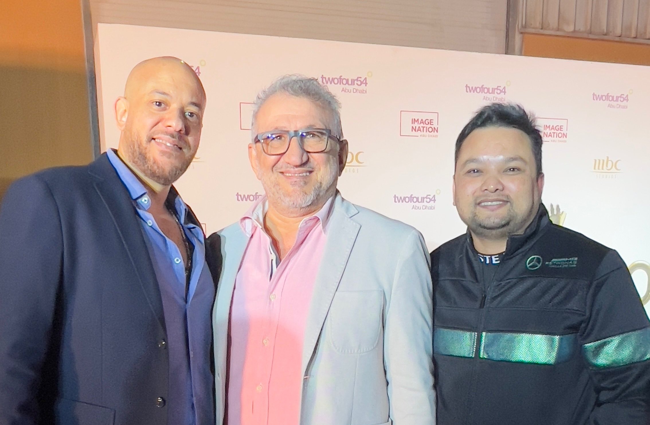
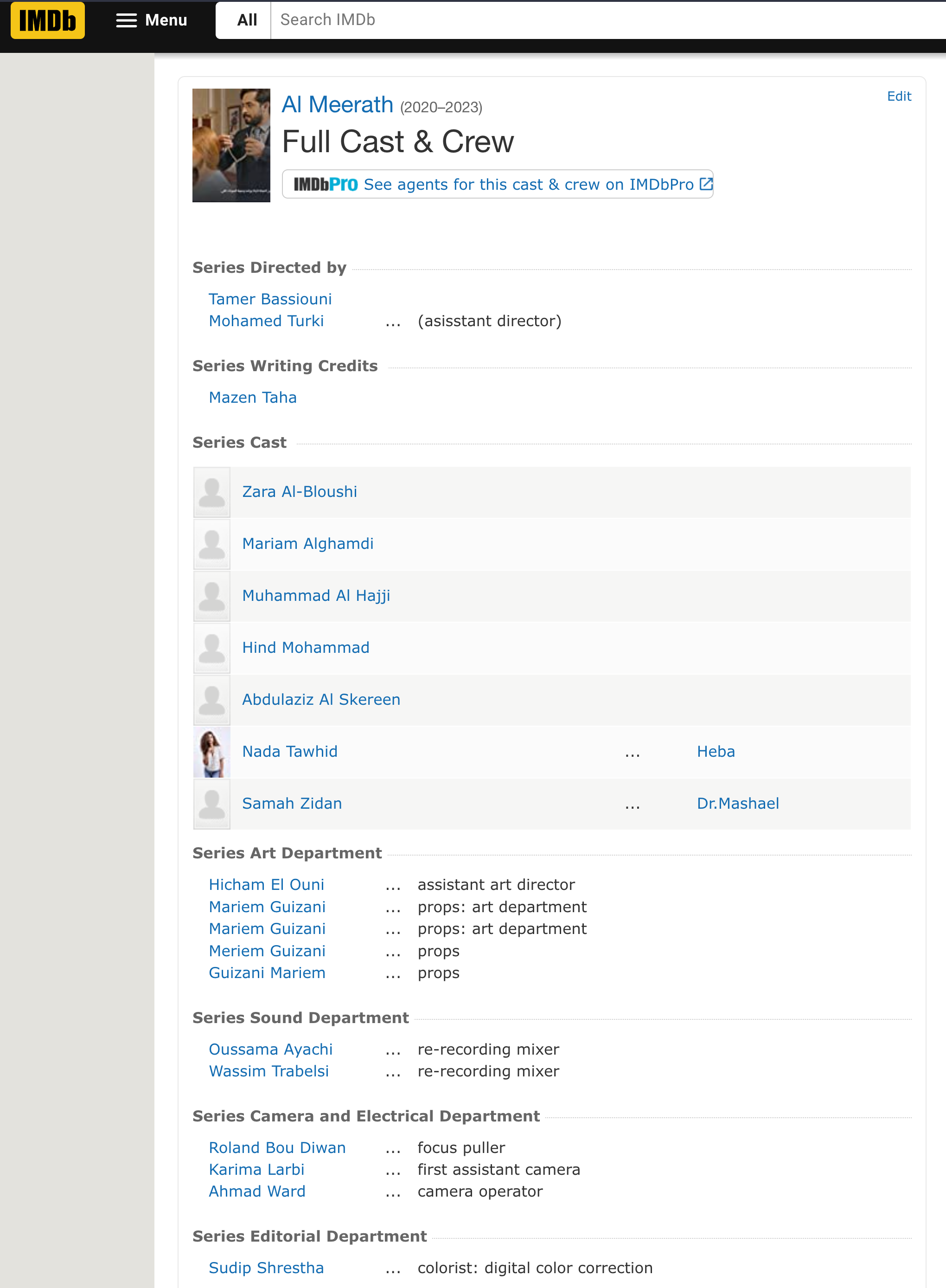
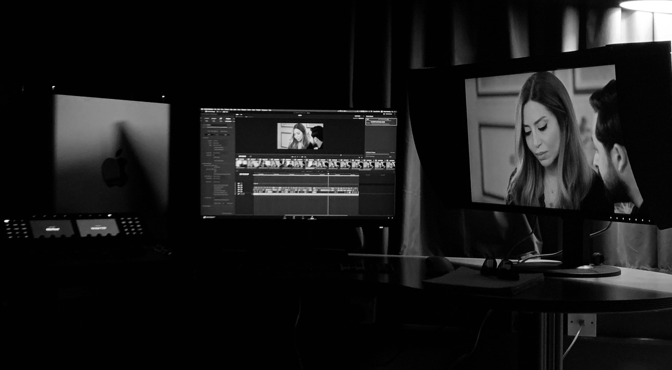
Bringing life to Saudi's magnum opus, Al Meerath (500 Episodes)

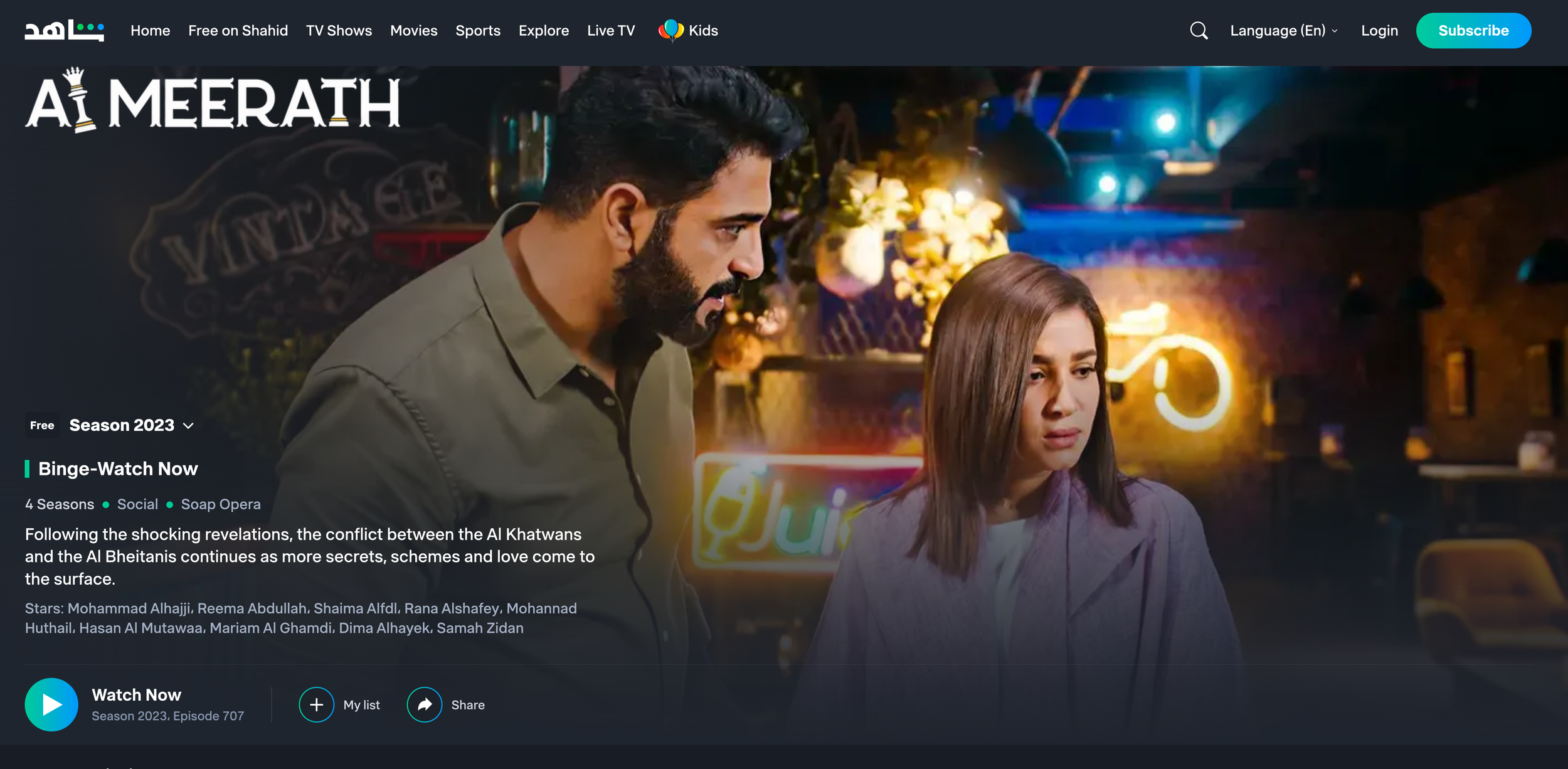
Al Meerath: Saudi Arabia's Magnum Opus:

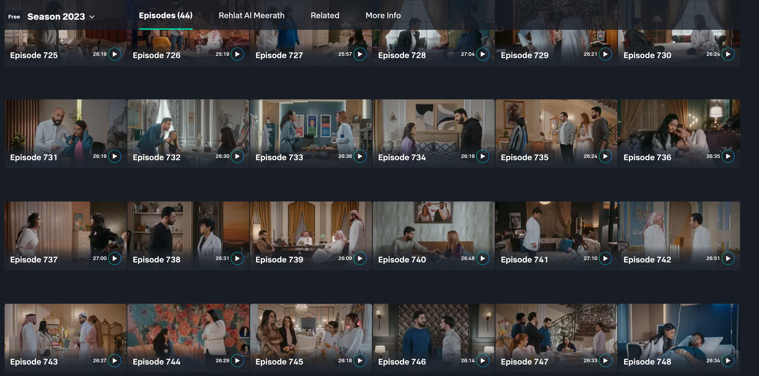
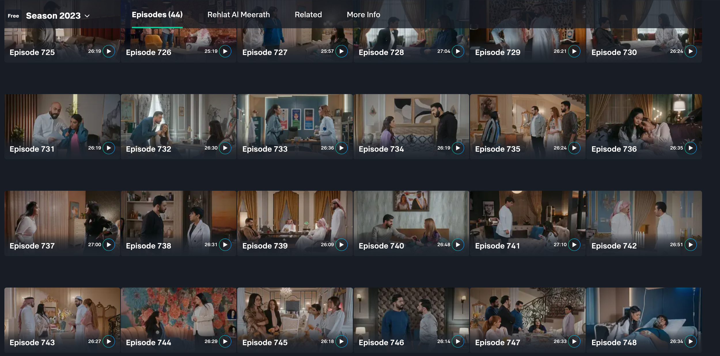
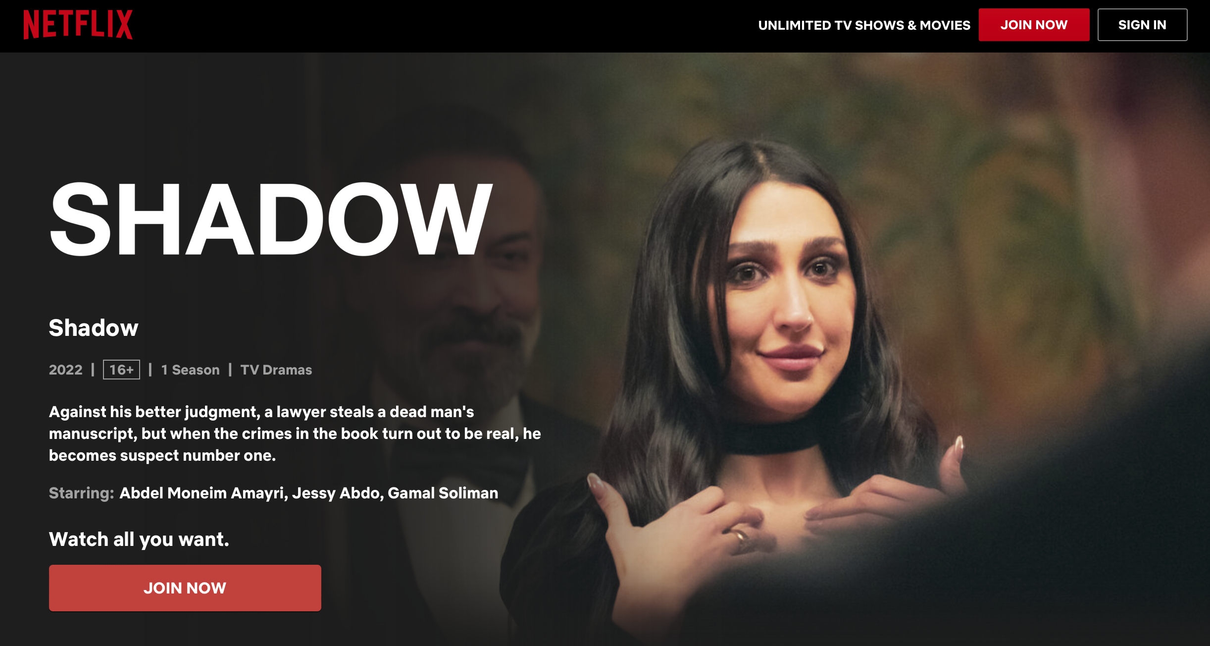
Al Meerath, a Saudi Arabian soap opera, has captured the hearts of millions of viewers with its engaging storyline and rich cultural representation. With a whopping 750 episodes, in 3 years. It stands as the epitome of Saudi Arabian television production. (2019-2022)

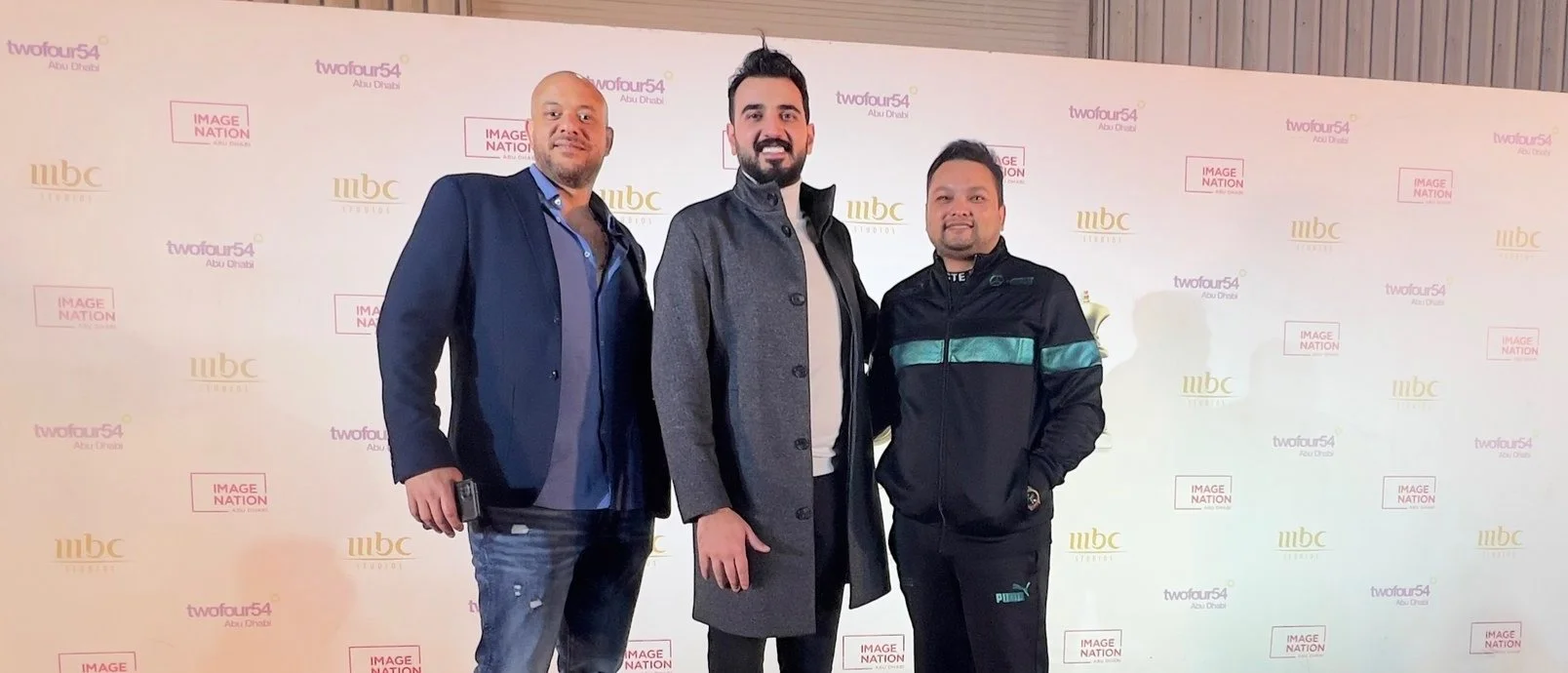
The magnitude of this project demanded exceptional craftsmanship, and Sudip Shrestha, the Nepalese colorist, played a pivotal role in the visual brilliance of Al Meerath. - Ayman Tonsi -editor

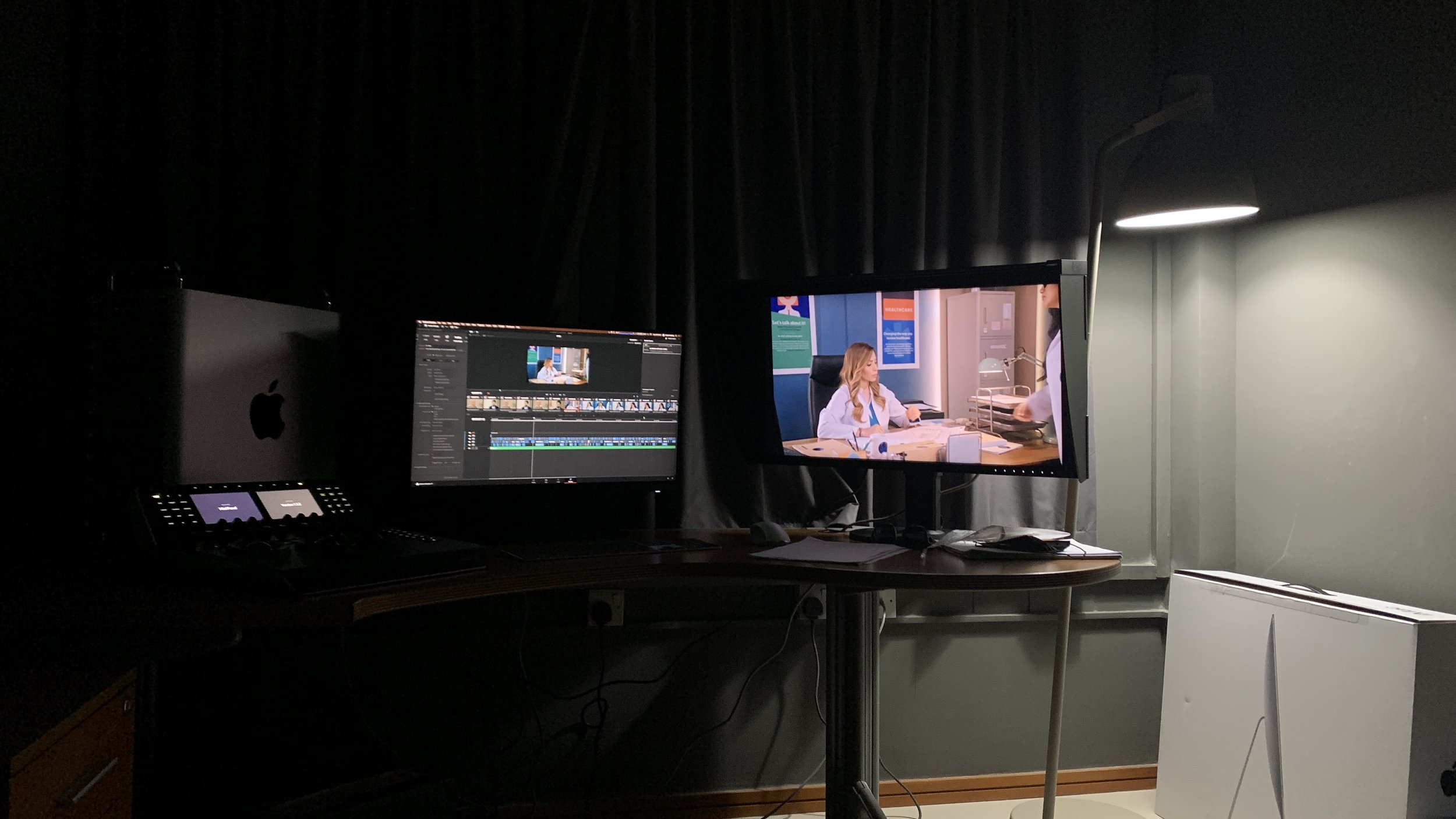
in tech

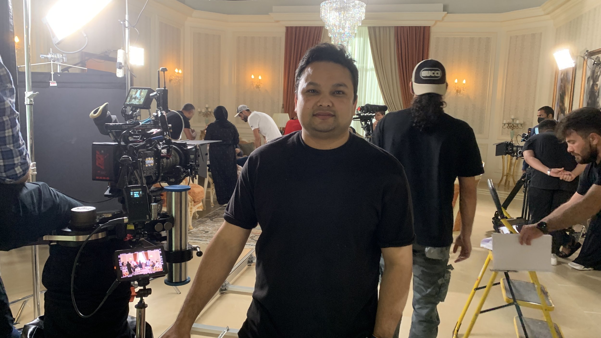
Sony Venice 3 set
Edit Share
Davinci Resolve
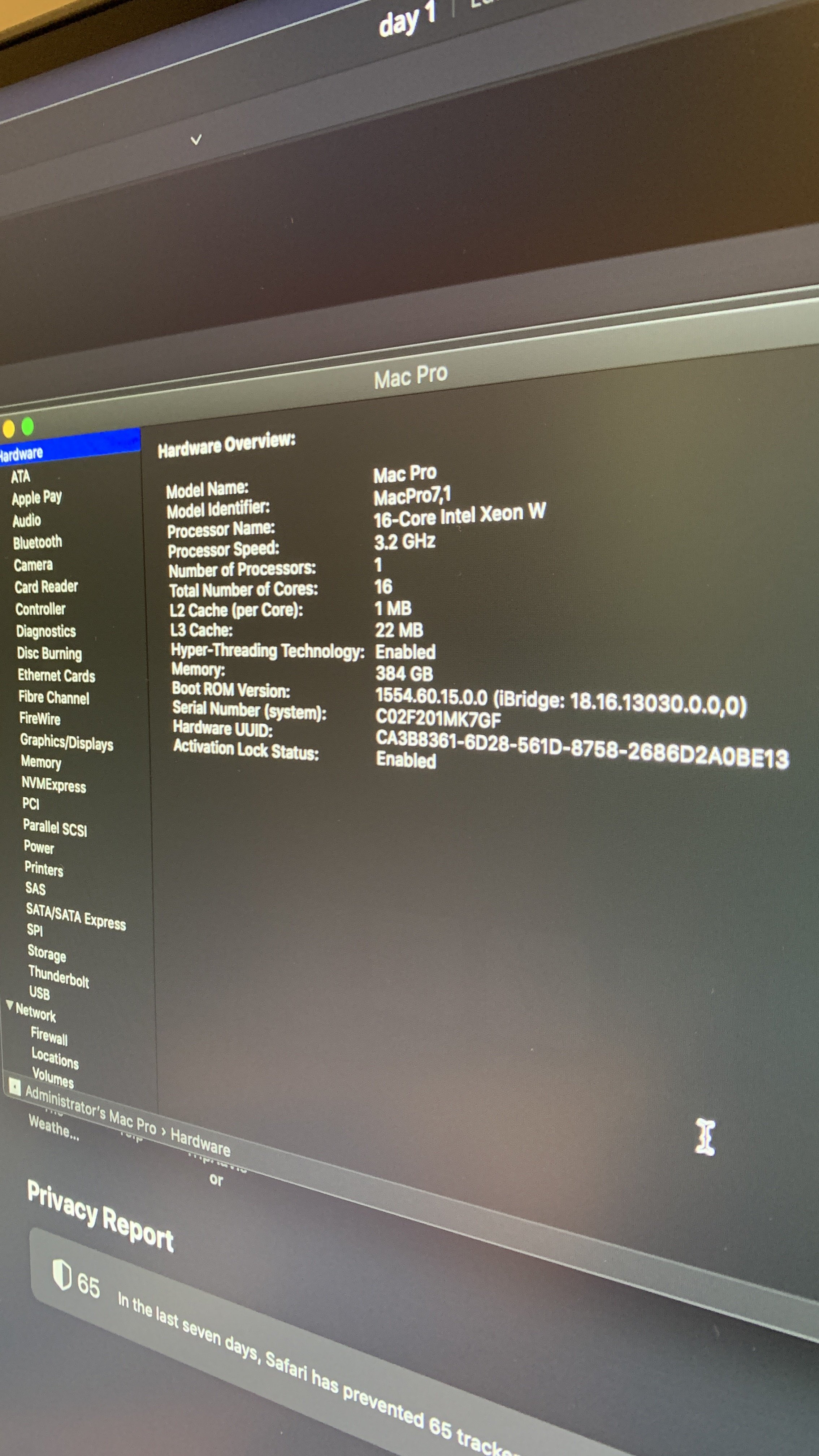
Apple Macpro
Eizo monitor

Al Meerath 500 Episodes - Sudip Shrestha (colorist)

How to create stunning music video in low budget?

Creating a visually appealing music video involves a combination of planning, creativity, and attention to detail. Here are some tips to help you make your music video look better:

  1. Develop a concept: Start by brainstorming ideas that align with the mood, lyrics, and overall feel of your song. Think about the story or visual elements you want to incorporate. A well-defined concept will guide your creative decisions throughout the process.

  2. Plan your shots: Storyboarding and shot lists can help you visualize how each shot will contribute to the overall video. Consider the composition, framing, and camera movements to create dynamic and visually engaging shots.

  3. Lighting: Lighting plays a crucial role in creating atmosphere and setting the tone of your music video. Experiment with different lighting setups to achieve the desired mood. Pay attention to natural lighting, artificial lighting, shadows, and color temperature.

  4. Location and set design: Choose locations and sets that complement your concept and enhance the visual appeal. Whether it's an urban street, a picturesque landscape, or an elaborately designed set, make sure the environment aligns with your vision.

  5. Costume and styling: The attire and styling of the artists can significantly impact the visual aesthetics of your music video. Select outfits and accessories that complement the concept and the mood of the song. Consider the color palette, textures, and overall visual cohesion.

  6. Cinematography: Experiment with camera angles, movements, and techniques to add depth and visual interest to your shots. Incorporate different techniques like panning, tracking, and aerial shots to create variety and captivate the audience.

  7. Editing and post-production: Skillful editing can enhance the visual appeal of your music video. Experiment with cuts, transitions, effects, and color grading to achieve the desired look and feel. Pay attention to the pacing and synchronization with the music.

  8. Visual effects: If your concept calls for it, consider adding visual effects to your music video. This can range from simple effects like color grading and overlays to more complex visual effects. Use effects sparingly and purposefully to avoid overwhelming the viewer.

  9. Choreography and performance: If your music video includes dance or performance elements, ensure that the movements are well choreographed and rehearsed. Strong performances can captivate the audience and make the video more visually engaging.

  10. Attention to detail: Small details can make a big difference in the overall visual quality of your music video. Pay attention to props, set dressing, makeup, and overall production design. Take the time to refine each aspect of your video to achieve a polished result.

Director of Photography - by Sudip Shrestha

Remember that experimentation and creativity are key to making your music video stand out. Don't be afraid to try new ideas, and always strive to align your visual choices with the mood and message of the song.

How to make your videos look beautiful?

Make it stand out

Whatever it is, the way you tell your story online can make all the difference.

Lights, camera, color! As a video color grading studio, we know that capturing beautiful footage is only half the battle. The other half is making sure that footage looks just as stunning on screen. That's why we're committed to making our color grading process as set-friendly as possible.

Here are a few ways we make sure our color grading process works seamlessly with your set:

  1. Flexibility: We understand that video shoots can be unpredictable, with lighting conditions changing from shot to shot. That's why we offer flexible scheduling options and can work with you to accommodate any last-minute changes to your shoot.

  2. Real-time feedback: We can provide real-time feedback on set to make sure that the footage you capture is optimized for color grading. This can save you time and money in post-production, and help you achieve the look you want.

  3. Collaboration: We work closely with you and your team to ensure that our color grading process is seamless and fits within your workflow. We'll be there every step of the way to answer any questions you have and make sure the final product exceeds your expectations.

  4. Portability: Our color grading equipment is designed to be portable and can be brought to your set if needed. This can save you time and money on transportation costs, and help keep your project on schedule.

At our video color grading studio, we're dedicated to making sure our process is set-friendly and works seamlessly with your production. We understand that every project is unique, and we'll work with you to create a customized solution that meets your specific needs. So why wait? Contact us today and let's create something amazing together!

Created using ChatGPT

How to color grade videos? Guide

How to Color Grade?

Color grading is the process of adjusting the colors and tones of a video to achieve a specific look or mood. Here is a general overview of the steps involved in color grading a video:

  1. Correct any technical issues: Before color grading your video, it's important to ensure that the video is technically sound. This can involve adjusting the exposure, white balance, and contrast to ensure that the footage is well-exposed and has accurate colors.

  2. Choose a color grading software: There are many color grading software options available, including DaVinci Resolve, Adobe Premiere Pro, Final Cut Pro, and others. Choose a software that suits your needs and preferences.

  3. Create a reference image or video: Before color grading your video, it can be helpful to create a reference image or video that represents the desired look. This can involve taking inspiration from other films, photographs, or art.

  4. Apply a LUT or preset: Some color grading software may include built-in LUTs (Look-Up Tables) or presets that can be applied to your footage to achieve a specific look. Applying a LUT or preset can be a good starting point for your color grading.

  5. Adjust the color wheels and curves: Use the color wheels and curves in your software to adjust the hue, saturation, and brightness of your footage. This can involve adjusting the shadows, midtones, and highlights to achieve a balanced and pleasing color palette.

  6. Adjust the exposure and contrast: Use the exposure and contrast tools to adjust the overall brightness and contrast of your footage. This can involve boosting or reducing the brightness and contrast to achieve a specific look.

  7. Refine the color grading: Once you have adjusted the color wheels, curves, exposure, and contrast, refine your color grading by adjusting the colors and tones of specific elements in your footage, such as skin tones, backgrounds, and objects.

  8. Apply the color grading to the entire video: Once you are happy with your color grading, apply the adjustments to the entire video. This can involve copying and pasting the adjustments to other clips or using adjustment layers to apply the color grading to multiple clips at once.

  9. Review your color grading: Finally, review your color grading to ensure that it meets your creative vision and technical standards. Watch your video on different monitors and devices to ensure that the color grading looks consistent across different platforms.

Color grading can be a complex and time-consuming process, and it's important to have a good understanding of color theory and video editing principles before attempting to color grade your footage. With practice and experience, however, you can achieve stunning and creative results through color grading.

Learn One on One Color grading with us at our Boutique Colour Studio In UAE.

Importance of Color Grading in Commercials - CHAT GPT 4

Color grading is a crucial part of the post-production process in TV commercials. It's the process of enhancing and manipulating the colors in a video to create a specific mood or atmosphere. Color grading can help make a TV commercial look more polished and professional, and it can also be used to create a cohesive look across a series of ads. In this blog, we'll take a closer look at the color grading process for TV commercials and why it's so important.

The Importance of Color Grading in TV Commercials

Color grading is essential in TV commercials for a few reasons. Firstly, it can help set the mood for the commercial. The right color palette can create a sense of excitement, calmness, or even urgency, depending on what the advertiser wants to convey. Secondly, color grading can help create consistency across multiple commercials in a campaign. By using the same color grading techniques across all the ads, they can feel like a unified set, and viewers will be more likely to remember the brand.

The Process of Color Grading a TV Commercial

The color grading process can vary depending on the commercial, but generally, it involves the following steps:

  1. Color correction: The first step is to correct any color imbalances in the footage. This involves adjusting the brightness, contrast, and saturation of the video to create a neutral starting point.

  2. Establishing the look: Once the color is balanced, the colorist will work with the director or creative team to establish the look for the commercial. This could involve creating a specific color palette or mood board to guide the color grading process.

  3. Primary grading: This is where the colorist adjusts the overall color of the footage. They might adjust the temperature of the footage, tweak the shadows and highlights, or apply a color filter to create the desired look.

  4. Secondary grading: In this step, the colorist focuses on specific elements within the footage. For example, they might adjust the color of a particular object or person to make them stand out more.

  5. Finishing touches: The final step is to add any finishing touches to the color grading. This could involve adding vignettes, adjusting the overall brightness, or adding any necessary color effects.

Choosing the Right Color Grading Techniques

Choosing the right color grading techniques is essential to create the desired look for a TV commercial. Some common techniques include:

  1. Color filters: Applying a color filter to the footage can create a specific mood or atmosphere. For example, a blue filter can make a scene feel cold and clinical, while a warm filter can create a sense of coziness.

  2. Saturation: Adjusting the saturation of the footage can make the colors more vibrant or muted. This can be used to create a specific tone or to highlight certain elements within the scene.

  3. Contrast: Adjusting the contrast can create a more dramatic look or a softer, more romantic feel. It can also be used to bring out details in the footage.

  4. Color grading presets: Many color grading programs come with presets that can be used to create specific looks quickly. These presets can be a great starting point for a colorist to work from.

Conclusion

Color grading is an essential part of the post-production process for TV commercials. It can help set the mood for the commercial and create consistency across a series of ads. By choosing the right color grading techniques and working closely with the director or creative team, a colorist can create a stunning and memorable TV commercial.

Contact us - Colourstudio for world class color grading service in UAE.

Camera setting for Dolby Vision Mastering

What is dolby vision?

Original Camera Sources

For mastering first run movies in Dolby Vision, the original camera files or original film scans are ideal as modern digital camera systems as well as negative film stock can capture 13+ stops of dynamic range.

The exposure and lighting decisions made on set will determine the level of dynamic range and usable color gamut for a Dolby Vision HDR master.  While it is possible to stretch the dynamic range of the content in post-production the best results are really defined by the HDR image that is captured in the acquisition phase.

Digital camera sources:

For any digital acquisition we recommend using either RAW recording (no de-mosaicing / de-bayering performed in camera), or if not available or applicable using a compressed source format in its lowest available compression and highest quantization (bit depth) using a “log style” OETF (Opto Electrical Transfer Function). Intra-frame codecs should be preferred over Long-GOP codecs.

Assuming a correct exposure, the following original sources can be considered as minimum requirements for Dolby Vision mastering.

Capture Format

  • RAW - ArriRaw, RedCode, Sony X-OCN etc.

  • Compressed - XAVC-I, ProRes or other I-Frame only formats

Quantization (min.)

  • 16bit linear

  • 10 bit log

OETF - Capture transfer function

  • LogC, S-Log,3 Log3G10, etc.

Color Space

  • Camera native color space - S-Gamut3, REDWideGamutRGB, Panasonic V-Gamut, etc.

No looks, color corrections or other transforms should be baked into the original camera files. Some cameras’ default color space is set to Rec.709 or sRGB. This color space should not be used for recording. Record in the camera’s native color space, instead.
 

Mobile media sources:

Depending on the budget, story, or when a small, flexible camera is required, creators might want to incorporate content captured by a mobile phone, like the iPhone 12 as well. Using phones to capture real-life situations also often has the advantage that those being filmed are more likely to act naturally than if a larger camera and recording equipment are being used. However, if you are in any doubt about whether a phone should be used as part of your production, as with any other camera selection, this should be checked with those who are commissioning the content you are producing. 

The Dolby Vision iPhone recording specifications (Profile 8.4)

Codec/Format:

  • HEVC Main10 video in Apple Quicktime container (.mov)

HDR format:

  • Dolby Vision with HLG base layer (Profile 8.4)

Transfer Characteristic:

  • HLG (ITU-R BT.2100-1)

Color primaries:

  • BT.2020

Chroma sampling:

  • 4:2:0

Bit depth:

  • 10 bit

Film sources:

Scanning Format

  • ADX OpenEXR

  • dpx

Quantization (min.)

  • 16bit linear

  • 10 bit log

Source - professionalsupport.dolby.com/