Color Suite to Bloatware Davinci Resolve 21

The Bloatware Dilemma: Why Resolve 21’s Photo Page Has Colorists Ringing the Alarm

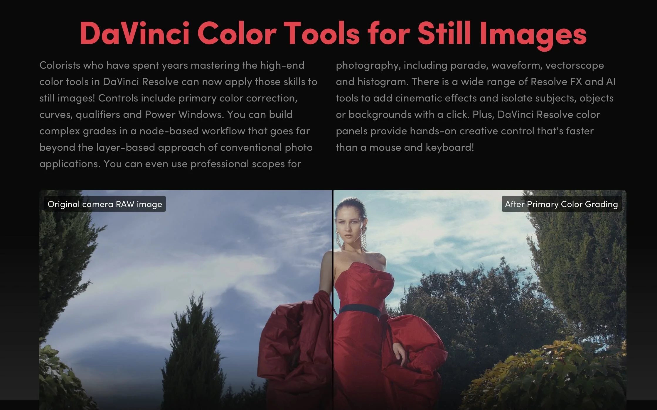
Blackmagic Design dropped DaVinci Resolve 21, and the headline feature sparked an immediate civil war in the post-production community. Alongside expected AI upgrades like IntelliTrack, Blackmagic unveiled a fully dedicated Photo Page designed to process, manage, and grade RAW still photography using Resolve’s famous node-based system.

While hybrid content creators praised the update as a potential "Adobe killer," professional colorists are pushing back hard. The community consensus? Blackmagic is steering its flagship program directly into "jack of all trades, master of none" territory, risking the very stability that made the software an industry standard.

The All-in-One Trap: From Color Suite to Bloatware

For a decade, Blackmagic’s aggressive expansion has been celebrated. They took an elite, expensive color-grading platform and seamlessly stitched in the Edit, Cut, Fusion (VFX), and Fairlight (Audio) pages. It was a masterclass in disruption.

However, with the introduction of the Photo page, colorists argue that Blackmagic has crossed a line from "post-production suite" to unnecessary software bloat. Video and film are time-based mediums. Photography is spatial and static. Forcing a photo cataloging and raw processing system into a video render engine feels less like a strategic evolution and more like a feature-creep identity crisis.

Why Colorists Are Criticizing the Photo Page

The core objection from colorists isn't that they hate photographers; it's that they fear code instability and distracted development priorities.

  • The "Jack of All Trades" Dilution: When software tries to handle everything—from 3D spatial audio mastering to Lightroom catalog migrations—engineering resources get split. Colorists are frustrated that decades-old bugs or niche workflow requests on the Color Page are taking a backseat to building tethering systems for still cameras.

  • The Lightroom Comparison is Flawed: YouTube thumbnails might scream "Goodbye Lightroom," but professionals know better. Resolve 21 lacks critical photographer infrastructure: standard print modules, advanced lens correction profiles, pixel-level healing brushes, and native DNG exports. It’s clunky for photographers, making it a feature nobody asked for.

  • Performance Hijacking: Running a high-end color panel (like the Advanced Panel) to tweak a single JPEG image feels absurd. Colorists worry that the underlying database and GPU acceleration architectures will suffer under the weight of managing thousands of high-megapixel static image files alongside heavy timelines.

A Warning from Creative History

The industry has seen this movie before, and it didn't end well. Look no further than Adobe. Photoshop, once a pure digital darkroom, became bloated with 3D engines and video timelines that users despised, forcing Adobe to eventually strip them out.

By pushing Resolve into the photo arena, Blackmagic risks alienating the core demographic that built the software's prestige: the professional colorist. When Hollywood facilities choose a color grading platform, they choose it because it is the absolute master of color—not because it can also edit a wedding photographer's RAW files.

Final Thoughts: Stick to the Code

Blackmagic Design deserves credit for their legendary free-update model and fierce defense of perpetual licenses. But DaVinci Resolve 21's Photo page feels like a feature built for marketing bullet points rather than professional necessity.

If Blackmagic wants to conquer the photography market, they should build a dedicated standalone app. Forcing it into Resolve risks breaking the finest color tool ever made by turning it into a sluggish, generalized ecosystem. Sometimes, being the master of one is exactly what the industry needs.

What are your thoughts on Resolve 21? Are you using the Photo page, or do you think Blackmagic needs to stop adding pages and focus on core stability? Let’s discuss in the comments below.

How to create a film look? Arri Film Lab

ARRI Film Lab Review: A Colorist’s Take on Bringing Film Character to Digital

As a colorist, I’m always slightly suspicious of anything promising to make digital footage look like film.

Film emulation has become a crowded category, and there are plenty of plugins that can add grain, halation, contrast, or a vintage color palette. The difficult part isn’t adding those characteristics individually—it’s making them feel like they belong to the image.

That is what makes ARRI Film Lab interesting.

Developed by ARRI and released as a license-based OpenFX plugin, Film Lab is designed to bring the characteristics of analog film into a digital workflow. It gives the colorist control over film grain, color characteristics, halation, and gate weave, while working inside applications such as DaVinci Resolve and Baselight. It supports ARRI LogC3 and LogC4 workflows and can also be used with footage from other cameras when brought into the appropriate ARRI color pipeline.

First Impression: Simplicity Is the Strength

The first thing I noticed about Film Lab is how deliberately simple it is.

Instead of giving the colorist dozens of parameters for building a film response from scratch, ARRI concentrates the controls around a few recognizable characteristics. Grain can be based around 50D, 200T, or 500T negative-film characteristics, while the color section provides different print-stock and processing options, including reversal and bleach bypass. There are also controls for halation and gate weave.

From a grading perspective, I actually appreciate this approach.

A film-emulation tool can easily become another rabbit hole inside the grading suite. You start adjusting grain size, softness, chroma response, highlight roll-off and several other parameters, and suddenly you're spending more time building the emulation than grading the picture.

Film Lab feels more like a finishing tool than a laboratory experiment.

You make your primary correction, establish the creative look, and then use Film Lab to introduce the film character.

The Grain

Grain is probably the first thing most people will look at when evaluating Film Lab.

ARRI gives you three negative-film references—50D, 200T and 500T. The important thing, of course, is that these aren't literally turning your digital camera into a particular physical film stock. They are digital recreations of characteristics associated with those stocks.

I found the restraint particularly useful.

Good film grain shouldn't announce itself immediately. It should become part of the texture of the image. At stronger settings, the effect becomes obviously stylized, but at lower intensities it can help take some of the sterile perfection out of digital footage.

That distinction matters.

The goal isn't necessarily to make the audience think, “That's film grain.” The goal is to make them feel that the image has a different physical quality.

Color: Where Film Lab Becomes More Interesting

For me, the more important part of Film Lab isn't actually the grain. It's the way the color response interacts with the image.

ARRI describes the color controls as covering different print-stock characteristics, reversal-film characteristics and bleach-bypass processes.

This gives the colorist a useful starting point for developing a film-inspired palette without forcing the entire grade into an aggressive “film look.”

That's important because film character isn't simply warm highlights plus grain.

The relationship between skin tones, neutrals, saturated colors and shadows is what ultimately determines whether an image feels convincing.

With Film Lab, I prefer approaching the tool as the final layer of a grade rather than using it as the grade itself.

First establish exposure.

Then balance the image.

Then build the creative color palette.

Then let Film Lab provide the texture and film response.

That workflow keeps the colorist in control.

Halation: Less Is More

Halation is another feature that can easily be overused.

Film Lab simulates the red/orange glow that can occur around bright areas as light interacts with the different layers of photographic film.

Used carefully, this can be beautiful.

Used aggressively, it immediately looks like an effect.

My preference would be to keep halation relatively subtle, particularly on narrative work. The effect becomes most convincing when you notice the overall image feels more organic rather than when you can immediately identify a red halo around every practical light.

This is one area where the colorist's judgment matters more than the plugin's capabilities.

It Works Especially Well With ARRI Footage

This is where Film Lab makes the most sense to me.

ARRI has built the tool around its broader imaging ecosystem, and it supports LogC3/AWG3 and LogC4/AWG4 workflows. It can process RGB images from ARRI cameras as well as third-party cameras when they're correctly brought into the ARRI pipeline.

There is a reason this matters.

ARRI's camera images already give the colorist a strong foundation. Film Lab isn't trying to rescue poor footage. Instead, it can complement an image that is already technically solid and creatively well exposed.

That is perhaps the biggest lesson with tools like this:

Film emulation can't replace good cinematography.

Lighting, exposure, lenses, production design and filtration still determine the fundamental character of the image. Film Lab works best when those decisions are already doing the heavy lifting.

The ARRI Look Library

Another useful part of the ecosystem is the integration with ARRI's Look Library.

The Film Lab workflow can be combined with ARRI's predefined looks, giving the colorist a starting point for different visual directions. Independent testing has highlighted the usefulness of combining the Look Library with Film Lab while reducing the intensity of individual looks rather than simply running everything at full strength.

And that's probably how I would recommend using it.

Don't treat a preset as a finished grade.

Treat it as a creative starting point.

A good colorist should still be able to decide what the image needs rather than letting a preset make every creative decision.

The Workflow in Resolve

For a DaVinci Resolve colorist, the workflow is refreshingly straightforward.

Film Lab is available as an OpenFX plugin and can operate in real time at 4K with supported RGB workflows.

I would generally keep it toward the end of the creative node structure, after the image has been balanced and the main look has been established.

That makes it easier to control how much of the film character you're actually introducing.

It also means you can bypass or adjust the Film Lab treatment without rebuilding your entire grade.

That flexibility is particularly valuable when you're working on a long-form project where consistency between hundreds or thousands of shots becomes more important than making one spectacular still frame.

Where I Think Film Lab Falls Short

Film Lab's simplicity is also its limitation.

If you're the kind of colorist who wants extremely granular control over every aspect of a film-emulation process, Film Lab may feel restrictive compared with more elaborate dedicated film-emulation systems.

There are fewer knobs.

But I'm not convinced that's necessarily a problem.

More controls don't automatically produce a better image.

In fact, one of the strengths of Film Lab is that ARRI has made it difficult to endlessly over-engineer the look. Independent testing has similarly praised the plugin's straightforward approach and its ability to produce attractive results without extensive adjustment.

The other consideration is workflow. Although Film Lab can work with non-ARRI footage, it is clearly most naturally integrated into an ARRI color-managed environment. RE Effects notes that projects need to be working through the ARRI color-management pipeline, with ACES support planned.

So if your facility is built around a completely different color-management philosophy, you should test Film Lab carefully before making it part of a standardized pipeline.

My Verdict as a Colorist

ARRI Film Lab isn't trying to replace the colorist.

And that's exactly why I like it.

The best film-emulation tools don't make the grade for you. They give you another layer of photographic character that you can shape according to the needs of the project.

For me, Film Lab works particularly well when the brief is:

“Make this digital image feel photographic, organic and cinematic—but don't make it look like a plugin.”

Its biggest strength is its restraint.

The grain is easy to control. The color treatments provide a useful film-inspired foundation. Halation can add another layer of realism, and the overall workflow fits naturally into ARRI's ecosystem.

It won't magically turn every digital image into 35mm film. Nothing can.

But when used with good photography and a thoughtful grade, ARRI Film Lab can take an already strong digital image and give it that final bit of texture and imperfection that makes it feel less like a collection of pixels and more like a photographed image.

For ARRI-based workflows, I'd definitely put it on the shortlist of film-emulation tools worth testing.

Not because it gives the colorist more controls—but because it gives the colorist the right controls.

ARRI Film Lab — official ARRI page

ARRI Film Lab — RE Effects

True Hollywood Film Look - Filmbox Pro

Filmbox Pro: The Ultimate Film Look Development Tool for a True Hollywood Film Look in 2026

As a professional video colorist, I am always looking for tools that do more than simply add a “film LUT” to an image. A convincing cinematic image is not just about contrast, saturation, or adding grain. It is about how color, density, highlight roll-off, texture, halation, acutance, and print characteristics interact as a complete imaging system.

That is why Filmbox Pro has become one of my favorite tools for film look development.

Rather than treating film as a preset or a simple LUT, Filmbox Pro approaches the problem as a photochemical imaging process. Video Village describes it as a comprehensive emulation of the characteristics of film negative and print, including color response, tone, grain, halation and other spatial characteristics.

For colorists working on commercials, music videos, features, episodics and high-end branded content, this makes Filmbox Pro a particularly powerful starting point for developing a sophisticated Hollywood-style film aesthetic.

Why Film Look Development Is More Than a LUT

One of the biggest mistakes in digital color grading is thinking that a cinematic look can be created simply by applying a LUT.

A LUT primarily describes a mathematical color transformation. Film, however, is a physical imaging process.

Film responds differently to exposure, color, density and contrast. Highlights do not simply become brighter; they develop characteristic density and color behavior. Bright sources can interact with the emulsion to create halation. Grain is related to the photographic process rather than being a uniform overlay.

That distinction matters.

When I develop a film look, I want the image to feel as though it has passed through a coherent imaging pipeline—not as though someone placed a grain layer and a vintage LUT on top of digital footage.

This is where Filmbox Pro becomes particularly interesting.

Filmbox Pro Treats Film as a Complete Imaging System

One of the strongest aspects of Filmbox Pro is its architecture.

Instead of providing only a final color transform, Filmbox Pro separates the process into components such as Camera, Negative, Lab, Print and Display. This allows the colorist to approach the image more like a traditional film workflow.

The Negative stage can influence characteristics such as:

  • Color and tone

  • Grain

  • Halation

  • Acutance

  • Gate weave

  • Flicker

  • Aura

The Lab stage provides another level of creative control, while the Print stage allows the final character of the image to be shaped as though the negative were being printed.

This is a fundamentally different approach from simply choosing a “cinematic LUT.”

The Negative-to-Print Workflow Is a Major Advantage

For serious look development, one of my favorite features is Filmbox Pro's ability to separate Negative Only and Print Only processing.

You can create a workflow where Filmbox first creates the characteristics of a film negative, perform creative grading between the negative and print stages, and then apply the print process afterward.

This effectively gives the colorist a digital approximation of a film-DI workflow. Video Village specifically recommends this multi-node approach when you want creative operations to behave as though they are being performed between negative and print.

For me, this is where Filmbox Pro moves beyond being a “film look plugin” and becomes a look-development environment.

The Difference Is in the Highlight and Skin-Tone Behavior

A great film look should not make every image orange and teal.

In professional work, particularly narrative cinema and premium advertising, I want skin tones to remain believable while the surrounding palette develops character.

Filmbox Pro's film-based color response can provide a much more sophisticated starting point for this than simply manipulating saturation and contrast.

The goal isn't to make the audience think:

“That has a film LUT on it.”

The goal is for the audience to simply feel that the image has cinematic density, texture and dimensionality.

That subtlety is what I look for.

Halation That Actually Feels Photochemical

Halation is another area where many digital film-emulation workflows fall short.

A simple blur or colored glow around highlights can quickly look artificial.

Filmbox Pro approaches halation as part of its spatial film simulation, with controls for radius, opacity, color and larger-scale aura characteristics.

Used carefully, this can help create the subtle separation around practical lights, windows, specular highlights and high-contrast edges that audiences subconsciously associate with film.

The key word is subtle.

As a colorist, I would rarely recommend turning halation up simply because the control is available. The best film effects are often the ones viewers don't consciously notice.

Grain Should Be Part of the Image, Not an Overlay

Digital grain overlays often look like texture placed over a digital image.

Film grain should feel integrated with the image formation process.

Filmbox Pro's grain processing is designed around the emulated negative, rather than simply applying a generic noise layer. The plugin also provides detailed control over the negative's spatial characteristics.

This makes a significant difference when you're trying to create a premium 35mm or large-format aesthetic.

And importantly, more grain doesn't automatically mean more cinematic.

For a Hollywood commercial, I may want extremely restrained texture. For a period drama or independent feature, I may push the texture considerably further.

The creative decision should follow the story, not the plugin.

Choosing the Right Film Stock

Another reason I recommend Filmbox Pro for serious look development is the range of film systems and stocks available.

The current Filmbox Pro ecosystem includes systems such as Vision3 and Vintage Cinema, with different negative and print characteristics designed to work together.

This gives the colorist a much more useful question than:

“Which LUT looks cinematic?”

Instead, the question becomes:

“What photographic behavior supports this story?”

Do I want:

  • Clean, modern 35mm?

  • Softer vintage color?

  • Fine-grain large-format character?

  • Stronger halation?

  • More restrained saturation?

  • A warmer print response?

  • A more nostalgic negative?

  • A harder, more graphic contrast structure?

These decisions become part of the look-development process.

Start With Filmbox—Then Grade

One important point: I don't believe Filmbox Pro should replace the colorist.

It should empower the colorist.

I generally think of Filmbox as a sophisticated film-imaging stage inside the grading pipeline rather than a magic button.

For example, exposure, balance and major image corrections can be performed before Filmbox, allowing the film emulation to respond to the image appropriately. Video Village recommends scene-referred, photometrically accurate operations upstream when authenticity is the goal.

From there, the colorist can use the Negative/Lab/Print architecture to develop the creative look.

That gives you considerably more control than applying a finished LUT at the end of the node tree.

Filmbox Pro Fits Modern Color-Managed Workflows

Another reason I consider Filmbox Pro particularly relevant to modern professional post-production is its support for advanced color pipelines.

It supports ACES 1.3, ACES 2.0 and Resolve Color Management, along with SDR and HDR workflows. It also supports major camera and intermediate color spaces.

This matters because today's productions increasingly move between:

  • ARRI LogC

  • RED

  • Sony

  • Canon

  • Blackmagic RAW

  • ACES

  • DaVinci Wide Gamut

  • HDR

  • Rec.709

  • P3

  • Streaming deliverables

A film look shouldn't fall apart simply because the project has a sophisticated color pipeline.

My Recommended Approach for a Hollywood-Style Look

If I'm developing a film look from digital camera footage, my philosophy is simple:

Don't try to make digital footage look “old.” Make it behave more like film.

I would start with properly managed, scene-referred camera footage.

Then:

1. Establish exposure and white balance

Get the image technically and photographically balanced before trying to create the look.

2. Choose the film system

Select the negative/print combination that fits the project rather than selecting a preset simply because it looks impressive on one shot.

3. Establish the negative character

Shape color response, density, contrast, grain and halation.

4. Develop the creative look

Use the Lab and, when appropriate, grade between Negative and Print.

5. Control the print

The Print stage can become the final creative personality of the image.

6. Finish for the delivery space

Make sure the final image is correctly transformed for the intended SDR, HDR or cinema mastering environment.

This approach produces a look that feels intentional rather than filtered.

Why I Recommend Filmbox Pro

There are many excellent tools available to colorists today.

But Filmbox Pro stands out because it doesn't simply ask:

“What film LUT do you want?”

It asks a much more interesting question:

“How do you want this image to behave as film?”

That difference is enormous.

Its combination of film-negative modeling, print processing, grain, halation, acutance, film systems, advanced lab controls and color-managed workflow support gives professional colorists a remarkably deep environment for developing film-inspired images.

And the included Looks Library can also provide useful starting points before moving into the deeper Pro controls. The library contains more than 100 presets designed as starting points for different aesthetics and film characteristics.

Final Thoughts

For me, the best film emulation is not the one that screams “FILM.”

It is the one that gives the image:

better color separation, richer tonal relationships, natural highlight behavior, organic texture, dimensionality and photographic character.

That's why Filmbox Pro is one of the first tools I would consider when developing a premium cinematic film look from digital footage.

Whether I'm working on a feature film, episodic series, commercial, music video or branded project, the objective remains the same:

Don't put a film look on the image. Build the image as if it were photographed on film.

That is where Filmbox Pro becomes extremely powerful.

Explore Filmbox Pro by Video Village

Disclosure: Filmbox Pro is a commercial product from Video Village. This article reflects my professional assessment of its capabilities as a film-look-development tool.

Download free DCTLs: The Ultimate Secret Weapon for DaVinci Colorists

DCTL (DaVinci Color Transform Language) is a C-like programming language built directly into DaVinci Resolve Studio that executes custom color math on your GPU. Unlike traditional LookUp Tables (LUTs) that force colors into rigid, pre-calculated grids, DCTLs compute exact mathematical formulas pixel-by-pixel using 32-bit floating-point math. This means your footage maintains total dynamic range without hard-clipping or artifacting.

If you want to move beyond standard presets and build or use elite, mathematically perfect color tools, understanding DCTLs is your next evolutionary step.

📊 DCTL vs. LUT: The Core Differences

Many editors confuse DCTLs with LUTs because they can sit in the same folder. However, the underlying technology makes DCTLs vastly superior for high-end workflows.

LUT
Uses static, pre-baked interpolation grids.
Risk of banding or artifacting.
Global opacity slider only.
Clips data outside 0–100% ranges.

DCTL (Color Transform Language)
Runs live mathematical formulas on the GPU.
32-bit floating-point precision.
Custom UI sliders and drop-down menus.
Preserves out-of-bounds image data.

🛠️ The Best DCTL Tools Every Colorist Needs

The color science community develops specialized DCTLs to perform tasks that native Resolve tools cannot replicate easily. Here are some of the most powerful options available:

  • Film Density Emulators: Tools like the Nx Density DCTL add deep, filmic saturation to specific hues without muddying dark areas.

  • Aura (FlexiMist): A specialized script that recreates iconic glass diffusion filters like ProMist directly inside your post-production suite.

  • Iridescent Color Saturator: An adaptive saturation tool that boosts low and mid-saturations without creating chroma noise.

  • NOIR Generator: A highly flexible, free pattern utility used for signal testing and analyzing spatial effects in your node tree.

  • PixelTools Exposure & Checker: High-end utilities designed to accurately map middle grey and monitor exposure.

Are you looking to buy professional DCTLs for your workflow, or are you trying to write a specific color-grading plugin yourself? Let me know, and I can give you a curated list of vendors or provide a custom code snippet!

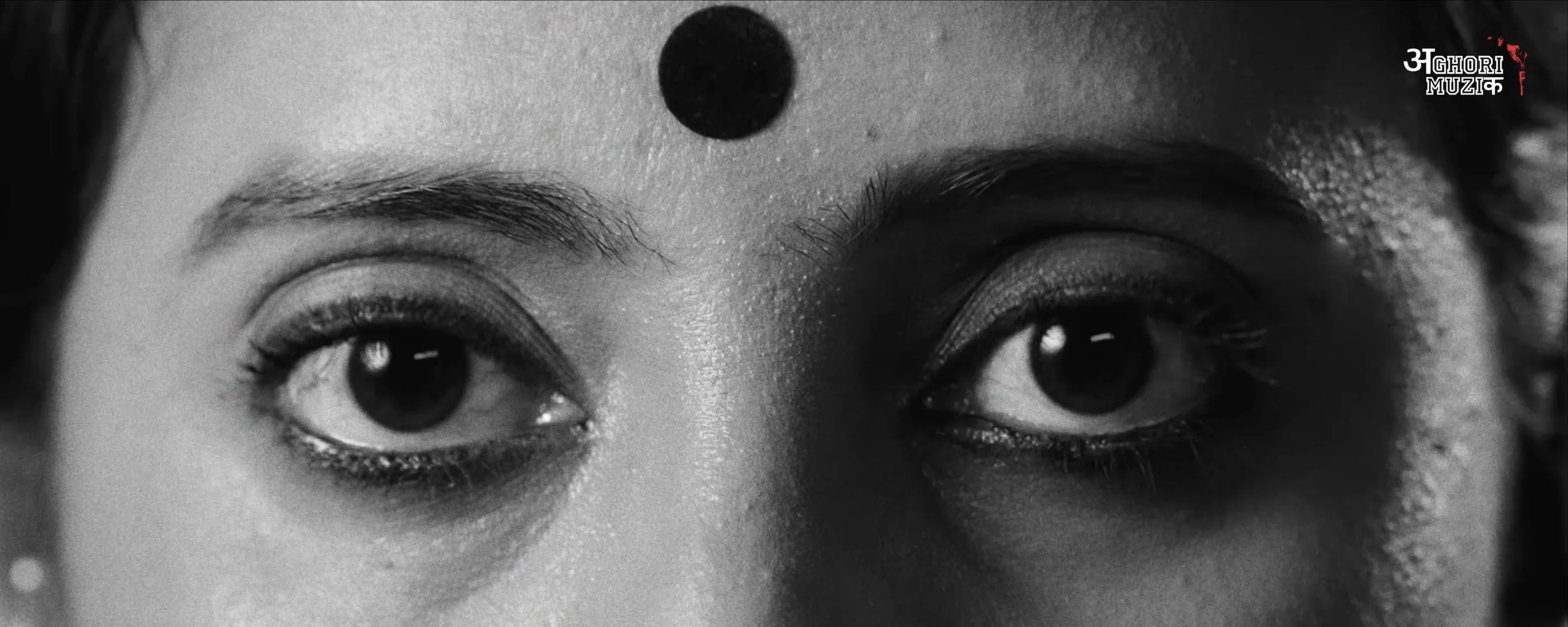
Color Grading for “Garba Gheli” | Aghori Muzik ft. Salim Merchant Filmikwork, Hollywood

Color Grading for “Garba Gheli” | Aghori Muzik ft. Salim Merchant

Color Artist: Sudip Shrestha | Filmikwork

“Garba Gheli,” the latest Hindi music video from Aghori Muzik, featuring legendary singer Salim Merchant.

Filmikwork provided professional music video color grading and color finishing for this vibrant celebration of Garba, Gujarat, and Navratri. The grade focused on rich colors, natural skin tones, cinematic contrast, and a polished contemporary music-video look.

The project brought together a talented creative team from India, with the final color finishing completed by Filmikwork.

Project: Garba Gheli – Aghori Muzik ft. Salim Merchant
Colorist: Sudip Shrestha
Color House: Filmikwork , Hollywood
Director: BIBTYA
DOP: Hardik Soni, Akshay Roshiya, Ronak Soni

Looking for a professional colorist in Los Angeles or Hollywood for your next music video, commercial, film, or digital project? Filmic LA provides professional color grading, color correction, and finishing services for clients in Los Angeles, Hollywood, India, and worldwide.

Hoyte van Hoytema - Master of Modern Cinematography

Hoyte van Hoytema - The Dutch Master of Modern Cinematography

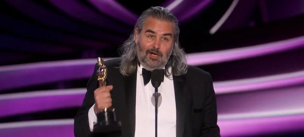
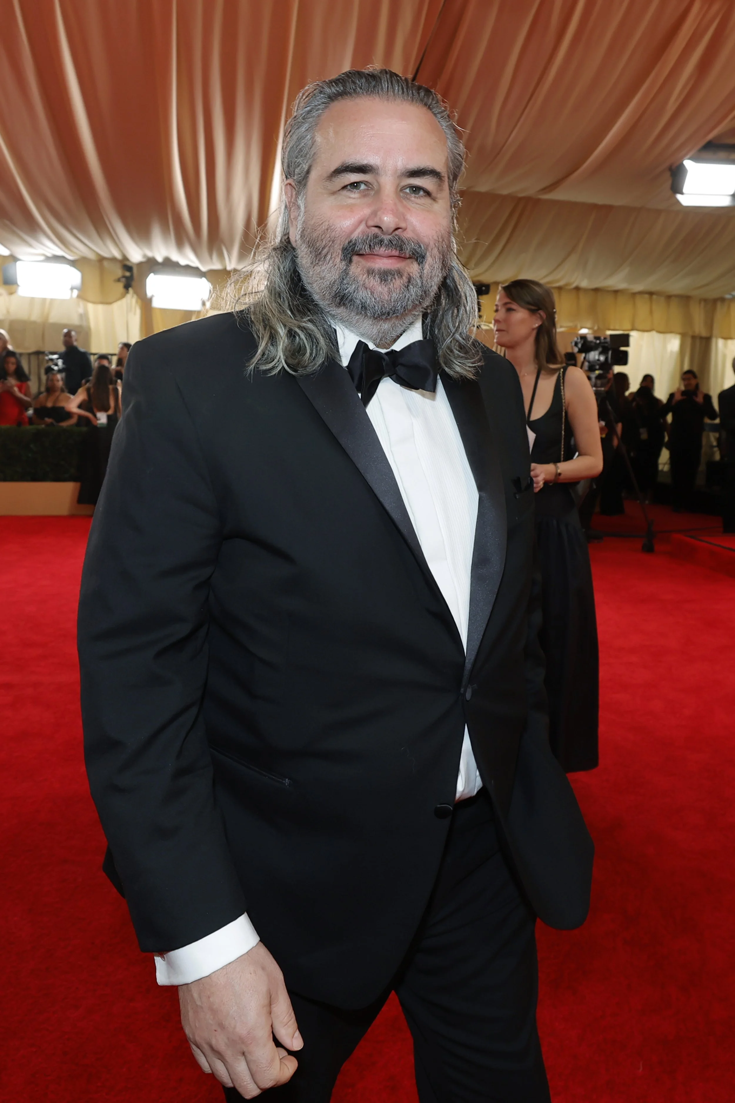
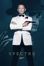
If you have marveled at the vast, terrifying emptiness of space in Interstellar or felt the claustrophobic tension of a World War II beach in Dunkirk, you have seen the world through the eyes of Hoyte van Hoytema. Born in Switzerland to Dutch parents and rejected twice by Dutch film schools, van Hoytema forged his own path at the National Film School in Łódź, Poland, eventually becoming one of the most influential cinematographers working today.

hoytema

Hoyte van Hoytema

Filmik - Master of Cinematography


The "Hoytema" Signature Style

What makes his work instantly recognizable? It is the contradiction of intimacy on a massive scale.

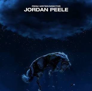
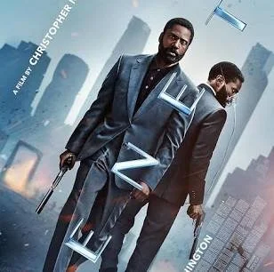
  • Humanizing IMAX: Van Hoytema is famous for shouldering massive IMAX cameras as if they were lightweight documentary rigs. On films like Tenet and Nope, he used handheld techniques to keep the audience physically close to the characters, making blockbuster spectacles feel personal and grounded.

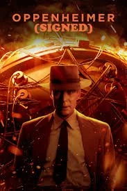
  • The Texture of Film: A staunch advocate for celluloid, he prefers the organic grain of film over digital. For Oppenheimer, he even pushed Kodak to create a brand-new 65mm black-and-white film stock to distinguish the timeline, a historic first for cinema.

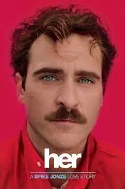
  • Natural Lighting & Shallow Focus: He often relies on natural light and "dirty" practical sources rather than over-polished studio lighting. In Her, he used a shallow depth of field (blurry background) to isolate the protagonist, emphasizing his loneliness in a crowded future.

    Why He Matters

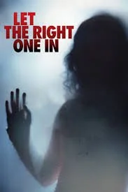
    Hoyte van Hoytema proves that cinematography is not just about "pretty shots"—it is about emotion. Whether capturing a vampire in the snow or an atomic bomb test in the desert, his camera always prioritizes the human feeling within the frame.


    Trivia: "Did you know he was rejected by film school twice before winning an Oscar?".