
With the invention of digital color-grading, the practice of tweaking the palette of films in post-production has exploded. So is the future all orange and teal?
You might have noticed a color revolution in cinema recently, because Hollywood seems to gave gone teal-and-orange crazy. Studio films from Hot Tub Time Machine to Iron Man 2 have used the combination, with the greenish-blue teal forming a backdrop and the orange (which includes flesh tones) in the foreground. The film blogger Todd Miro has suggested it's all down to the colors being complementary: "Anyone who has ever taken Color Theory 101 knows that if you take two complementary colors and put them next to each other, they will 'pop', and sometimes even vibrate," he wrote, posting dozens of stills from the year's big movies, united by the prevalence of teal and orange.

Back in the day, if you wanted your movie to have an artistic, stylish color palette, you had to go through the pain in the ass process of using filters on your lights and camera, or get the footage exposed just the right way. It was expensive, it was difficult and it was limited to people who really knew what they were doing. So if someone took the trouble, it meant they had a good reason, dammit.

It's no conspiracy, though, says Stefan Sonnenfeld, a leading Hollywood colourist who worked on the Transformers films (Miro counts them among the main offenders). "There's no specific colour decision-making process where we sit in a room and say, 'We're only going to use complementary colors to try and move the audience in a particular direction – and only use those combinations,'" he says. "Every film has its own look. We are always pushing our tools and our creative capabilities on every project."
"Color-grading is an absolute necessity now," says Sonnenfeld, "Because there are so many different formats that are being used, from film stock to digital capture, semi-professional to consumer cameras. Blending all that stuff and having it work cohesively is a very important part of the process."
Digital Colorization

The big change that digitization made was it made much easier to apply a single color scheme to a bunch of different scenes at once. The more of a movie you can make look good with a single scheme, the less work you have to do. Also, as filmmakers are bringing many different film formats together in a single movie, applying a uniform color scheme helps tie them together.
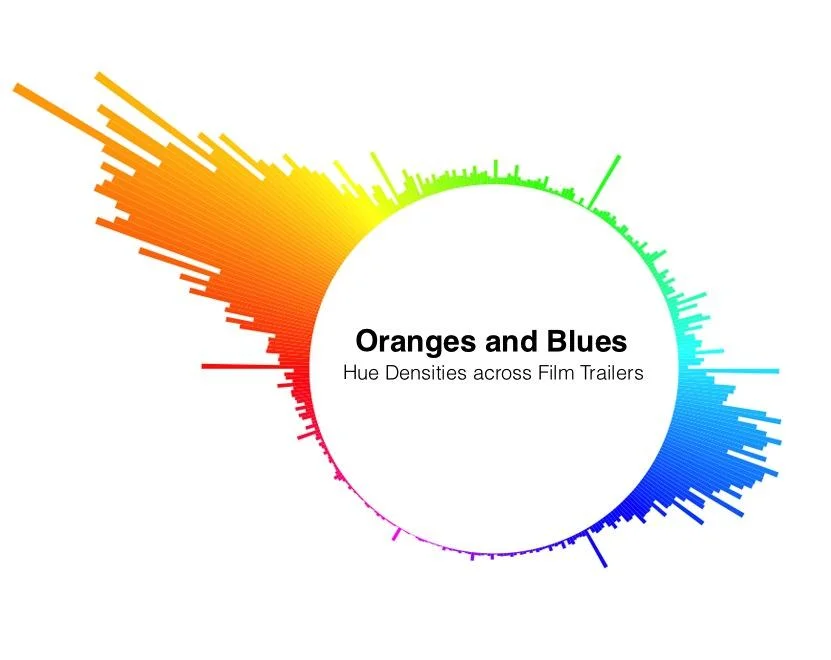
One way to figure out what will look good is to figure out what the common denominator is in the majority of your scenes. And it turns out that actors are in most scenes. And actors are usually human. And humans are orange, at least sort of!
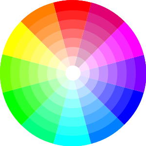
Most skin tones fall somewhere between pale peach and dark, dark brown, leaving them squarely in the orange segment of any color wheel. Blue and cyan are squarely on the opposite side of the wheel.
It seems plausible that, regardless of whether or not it has its origins in color theory, orange-and-blue has now reached the level of “convention.” For better or for worse, coloring your movie this way makes it really look like a movie.

But do colorists just execute directors' instructions, or are they artists in their own right? The lines have to be drawn on each job, and sometimes the colorists are forced to call the shots. As color grading technology continues to improve, we might see more filmmakers branch out into more novel palettes. Until then, keep an eye out for more orange and more blue.